

This was the lineup at the weekend when I sat down to choose my pens and inks for March. It is almost all the inks I own, the absences are one pack of cartridges which are living at work and one bottle which is hiding away until April. The initial whittling-down was pretty easy because I could take out the inks I used in February, plus anything which leaned too close to next month’s choice. I ended up with a nice, tight band of options to take forward into the next round.
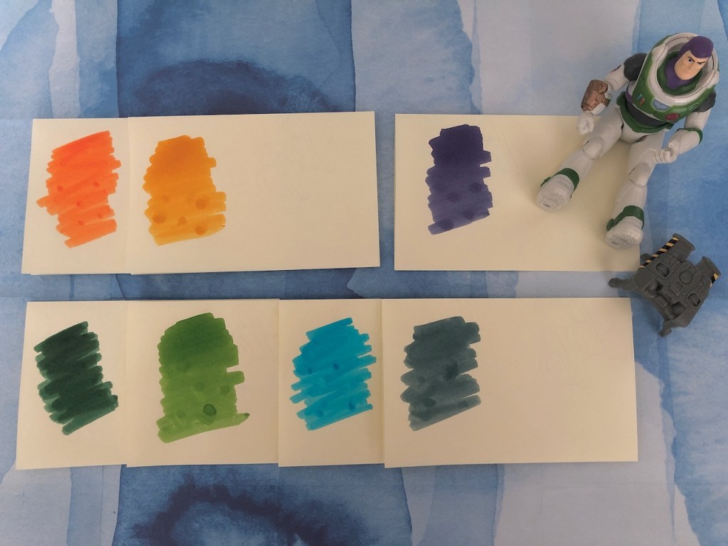
I swatched my seven choices so I could do some useful comparisons. I intend to get some kind of system going with ink swatches which will probably involve one of those index card boxes. I’ve chosen Basildon Bond notepaper which measures 178 x 137mm in the Champagne colour because I’m using books which have warmer paper colours and this will also tie in with some thoughts I’m having about next year’s diary. (What, already?) I’ve folded each sheet in half and applied a generous swatch with a cotton bud. The colours are: top l-r = Graf von Faber-Castell Burned Orange, Diamine Honey Burst, Graf von Faber-Castell Cobalt Blue. Then bottom l-r = Graf von Faber-Castell Moss Green, Diamine Meadow, Waterman Inspired Blue, Herbin Vert de Gris. The first colour to fall in this round was the Cobalt Blue because it’s just a touch too purple.
After this there was a lot of shuffling, first trying three-colour combinations, then adding a fourth colour into a couple of the mixes. From the start I knew I wanted either orange or honey or, quite possibly, both, and very likely Vert de Gris as well. I was a little sad when Burned Orange turned out to be the second shade jettisoned. This was quickly followed by Moss Green which wasn’t calling to me (a shame, considering how much of it I’ve got over my fingers). Three down, so would I opt to keep the remaining four or take it down to three? My final selection took me a little by surprise, but you have to go with what your eyes and your heart are telling you and in this case it turned out to be the three most vibrant shades. I dare say if it had been a dull and rainy morning I might have kept Vert de Gris.

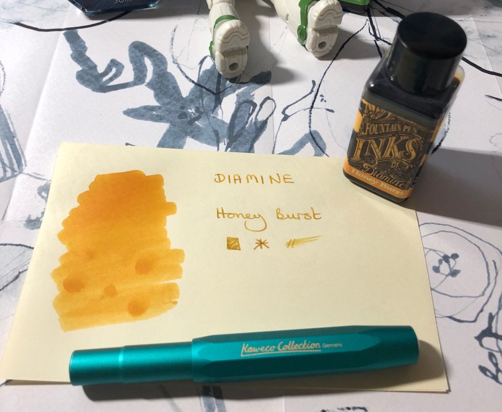
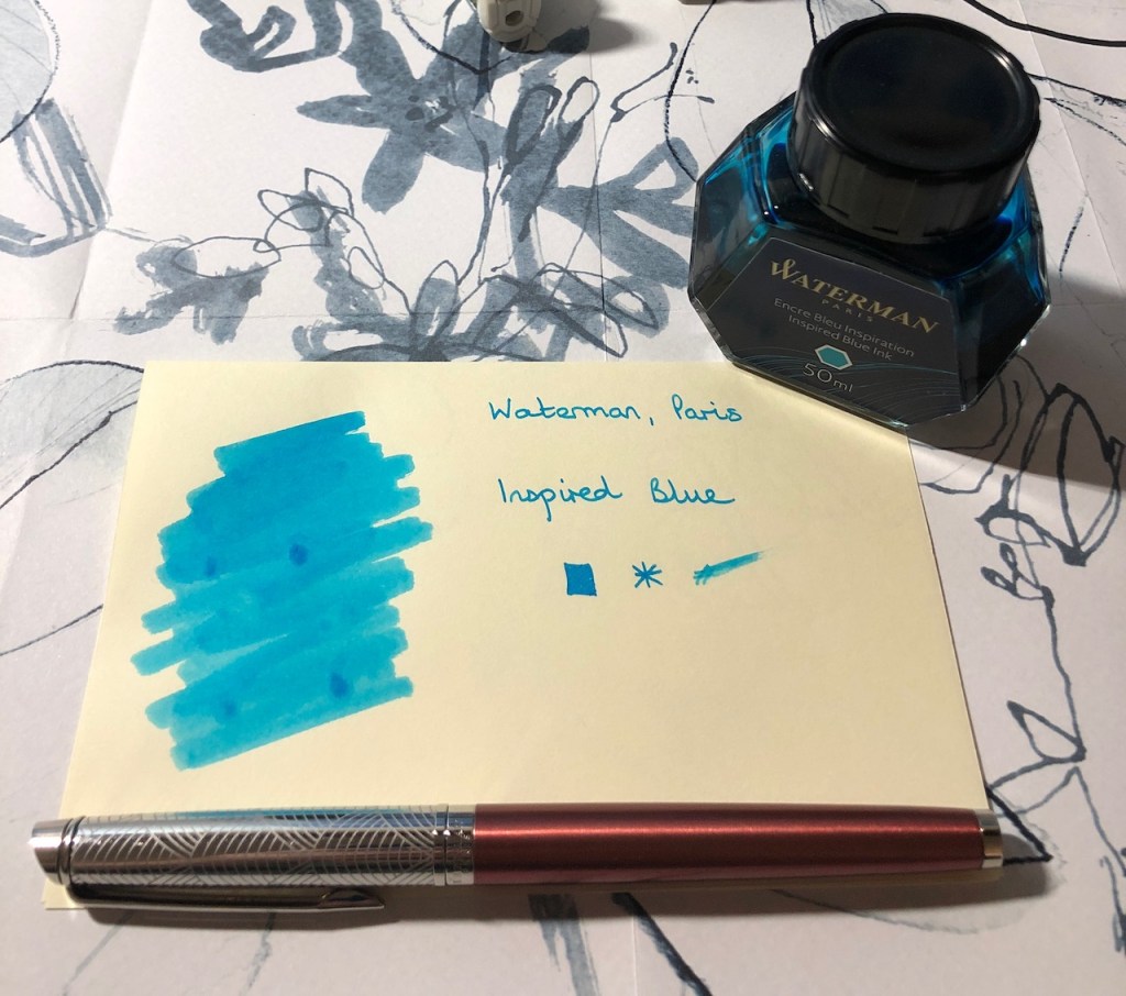
You can see now the next stage of my swatching format – adding the name of the ink once I’ve got it in a pen. Until that point I’m just pencilling the name on the back of the sheet to remind me what the swatches are.
The colour I’m least sure about is the Meadow because I have an uneasy relationship with this ink. I’ve put it in the Namisu Orion which is quite a wet writer and I generally find Meadow to be a rather watery ink – lots of shading but inclined to be too delicate for my tastes in its lighter parts. I’ll journal with it and see how we get along this time around. The Kawco has a medium nib so should provide a good coverage of Honey Burst. I envisage using this one to journal as well, plus bits and bobs of note-taking along the way. I’ve opted for my fine-nibbed Waterman Hémisphère as my final pen so that at least one pen will behave itself in my diary/planner. I love Inspired Blue so much, I don’t know why I felt surprised that I had to have it in the selection for this month.
It was fun to pick these colours and I can see the swatches being useful going forwards. I’ve already alluded to the fact that I have a plan for April, but I can see me looking for a new combination of colours as we move into May. Perhaps by then I’ll have found a pretty storage solution for my swatch notelets.

9 responses to “Bring on the inks”
Loving the orange and gold colours
the inspired blue is very pretty
You’re so right, Tanja. It’s one of my favourite inks and never disappoints.
Having now sorted some pens to write with and the issue of paper now being resolved (with your help) i decided this week to turn my attention to ink. So I turned to your posting here for inspiration. Oh the Honey Burst is warm and beautiful but then so is the meadow and Inspired Blue. I’m finding that after ordering the ink which offer the strongest ‘eye candy’ loveliness, I have found, in this short time , I appreciate the colours in a new and unexpected ways after using them in the pen.
Thanks for the swatch idea.
Dear Tim, I’m very glad that you have found the paper advice helpful and that you’ve taken some inspiration over ink colour (I’d love to hear what you have chosen). You are so right that the inks really find their feet in the pens. Pen/nib, ink and paper work together and changing any one element can change the experience totally. I think that is one of the true joys of using fountain pens as opposed to other writing implements. It’s something I’m hoping to explore throughout April. I don’t know if you enjoy YouTube videos, but there are a couple of channels which have some excellent content around ink colours. Chris Saenz is an American lady who does a monthly video showing the pens and inks she has chosen for that month, then comes back mid-month to do a report on how it’s going. Writerly Witterings (crime author Michael Jecks) did a series a few years ago which is still on his channel where he did writing samples of a vast number of Diamine inks. I go back to that pretty regularly.
Pretty colours. Love Meadow
Thank you, yes it is a pretty ink. Vibrant but with enough depth to be legible.
ive spent a very pleasent time making colour samples of the four inks i have already. But i have five more colours arriving in the post anyday ,(how exciting is that?). I will make samples of those and then send photos by email if that is apprpriate. There was no great science in the selection otger than they were comours that sang to me and i chose grey because i thought it would look great in my new lilac Twsbi Eco with a stub nib. How shallow is that? Will get back to you Pam.
Grey inks can be very interesting. I’d love to see what you receive.