

It was way back in January when I bought this journal and did my initial preview of it, in the “before time” as we might choose to think of it from the viewpoint of our pandemic present-day. Anyway, I’ve been using it for several weeks now and I think it’s time to revisit it and explain whether I am enjoying it.
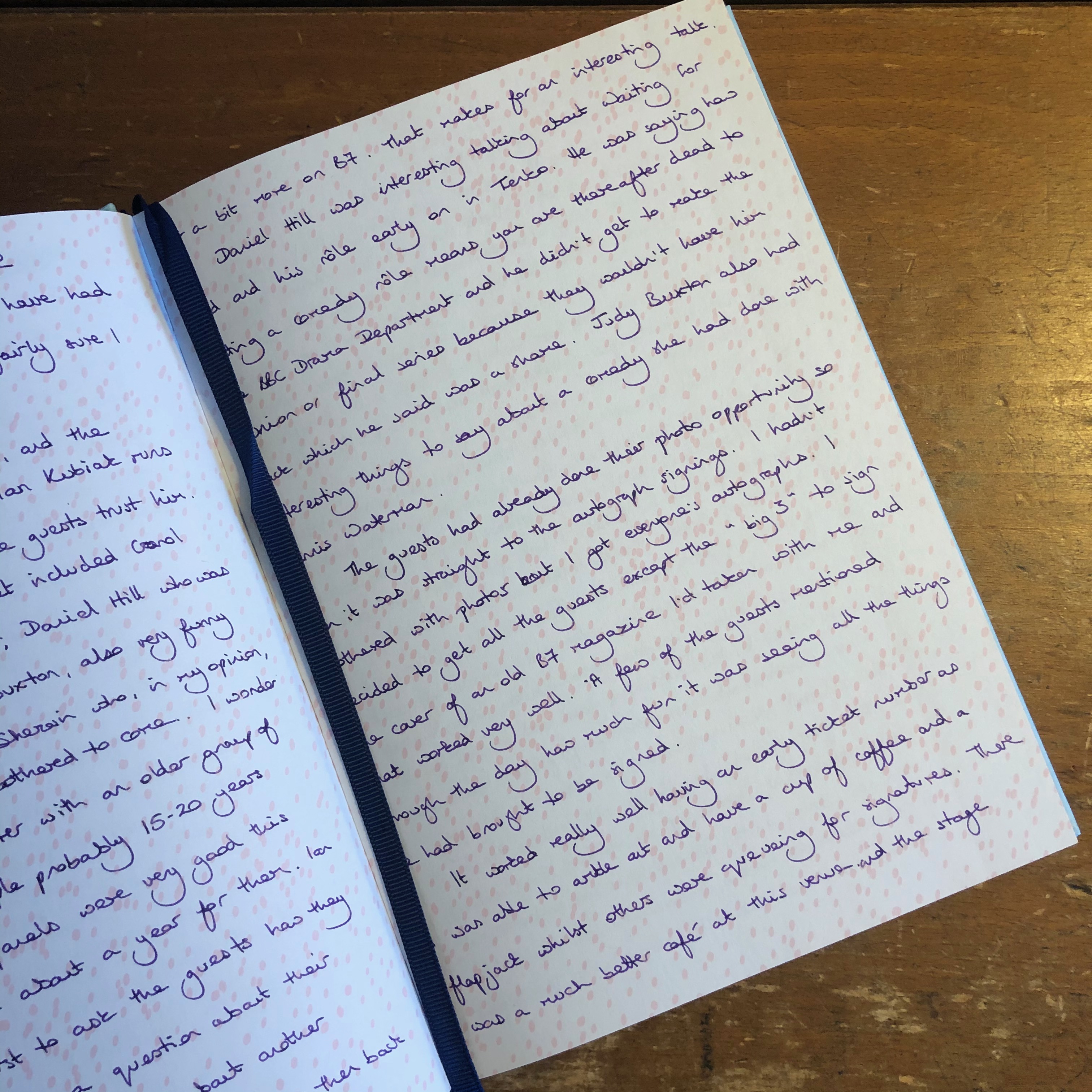
I think this photo might give you a hint. I find the paper quality is much worse than the “useable” conclusion I drew in my initial experiments, although to be fair my fountain pen inks don’t feather, smudge, or take an age to dry which are all good points. I’ve just been unable to reconcile myself to the amount of show-through and bleed-through. This happens to a varying extent depending on which inks I’m using, but nothing in my collection has yet proven to be entirely to my satisfaction.
When I started to use the journal at the beginning of August, I had Diamine Majestic Purple in a very fine-nibbed pen and that was probably the best combination I’ve used. I was able to ignore the ghosting and write on both sides of the paper. However, as I have continued through the book and with the change to Lamy Crystal Peridot ink, again with an extra-fine nib, I’ve become less and less tolerant of the show-through and bleed-through. Two weeks ago I was on the point of abandoning this journal altogether and moving into a better one, but I decided to use up the remainder by writing on the right-hand pages only. I might decorate the left-hand pages in some way, or just leave it as it is.
It’s not just this one pen and ink combination which brings out the worst on the paper, I have been writing my horoscope each day in Graf von Faber-Castell Electric Pink ink with an extra-fine nib and that has consistently produced specks of bleed-through and a fair amount of shadowing overleaf. This would be a good point to mention that right from the start of the journal, the paper quality has varied from one page to the next. Some sheets display less of what I consider to be the bad points, and some are noticeably worse.
This situation is a shame, but it doesn’t annoy me. I bought the journal at a heavily reduced price and am using it in a spirit of adventure, not with any plans to re-purchase or to make this range a regular choice for stationery. I felt a low level of aggravation when I was strugging to use both sides of each page, but now even that has dissipated. I’m happy to work through to the end, but I’m also looking forward to moving on to a new book for my daily meanderings – I reckon I’ve got about eleven or twelve more days in this journal.
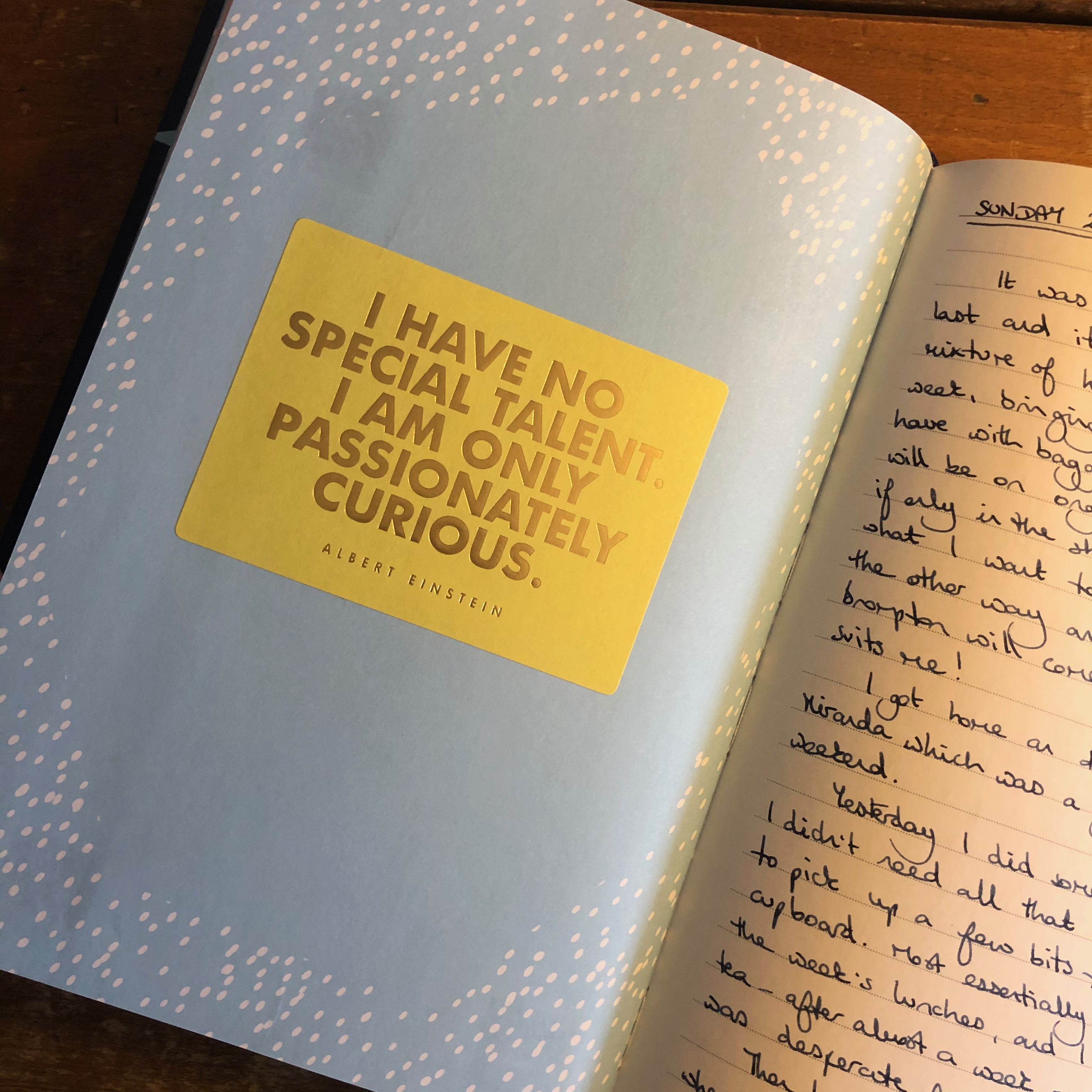
This isn’t the first time I’ve hit snags when using a bound book for my daily journal. Way back in March 2017 I bought a journal from Kikki K on my way through London and started it in the hotel at Brentford – the first entries are all about the Blakes 7 Convention I was attending (happy days). The journal was part of Kikki K’s “We are all creative” line which I adored, and on the whole I found the paper and even the embellishments interesting. The problem, however, was that some of the pages were printed with all-over designs and I found that whilst the white paper took fountain pen very well, often it wouldn’t absorb or dry on the printed areas. With that book, I ended up decorating some of these full pages by adding stickers, like the yellow one in my photo, whilst with some others I stuck a sheet of writing paper over the page. I also took the opportunity to stick in some memorabilia like a letter from my daughter.
Looking back at it, this is probably the journal that I am most happy with on a creative front and I wish I had recalled the decorating I did in this when I started the Aquarius book, because I could have had much more fun with it if I had. Perhaps it is not too late….

7 responses to “Revisiting my journal”
Oh how I love journals!! I am due for a new one.
Writing this post definitely has inspired me to do something creative with the pages I’m not using in my current journal. Do you already have a new journal lined up?
I don’t. I have to feel it and smell it and that is frowned upon these days. I could purchase something I have had in the past. For me, it is all about how my pen writes on the paper, and if I can open the journal wide enough to be comfortable when I write.
Yes, it doesn’t matter what wonderful features a journal includes, if your choice of pens doesn’t work well with the paper then it’s never going to be right for you.
For future reference you might find that an iron gall ink such as Rohrer & Klingner Salix, or a pigment ink like Sailor Kiwa Guro get around this problem of ink bleeding through your paper. Worth a try.
Ooh, interesting, thank you. I am tempted to try some Rohrer und Klingner so that’s a distinct possibility.
[…] Revisiting my journal – Pam Alison Knits […]