
I didn’t altogether get to grips with April, and it was quite a relief to get to the 30th, write the F Scott Fitzgerald quote that always haunts me as April ends, and move on into May. I didn’t love my pen and ink choices for the month, but I’m not sure that anything else would have pleased me more. Sometimes you have to ride the troughs and then make improvements when you catch hints of an upturn.
One particular disruption in April came in the form of me shelving my Filofax Personal-size Holborn in favour of an A5 option. I started April intending to work on making the Holborn feel more creative, but as I considered what that might look like, I couldn’t get past the need for A5 paper. I caved and set up my William Hannah notebook which immediately felt more creative, with room to write and high quality paper to write on. I used nice, bright, sunshine-yellow cardstock inner covers and re-wrote the key notes I like to have with me every day. It was all going to be lovely. I mentioned in last month’s plans that I was thinking of doing this for One Book July; how about One Book April?
It lasted two days and ended with the realisation that I prefer rings over discs as a loose-leaf mechanism. Don’t get me wrong, William Hannah’s notebooks and discs are the top of the tree in my opinion for discbound products. I just feel more at home on rings. Plus, I hit on a perfect solution to my archiving dilemma – by slightly adapting the 6-hole punching, I can archive the A5 Filofax pages into a standard 2-ring A5 lever arch file. I bought two files to experiment and it works perfectly. I was able to file away a whole year’s inserts from the A5 Original which freed that up to take over from the William Hannah as my everyday go-to planner/notebook solution. I carried on using the Personal-sized diary pages as these will fit A5 rings if you remove the bottom corner. (I’ve also carried on archiving this year’s diary into the William Hannah archive set because I want it to be cohesive.) I ported across the yellow inner covers and a lot of the William Hannah paper, and everything about the set-up felt more creative. Yet I found, as the month dragged towards a close, that I was missing the Personal Holborn.
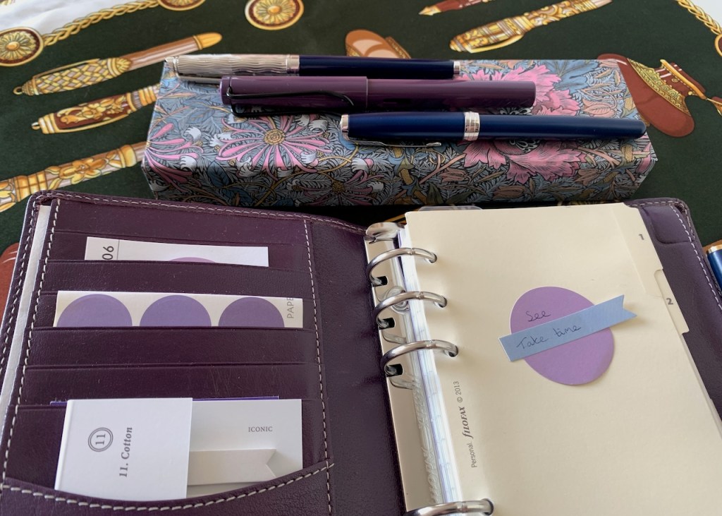
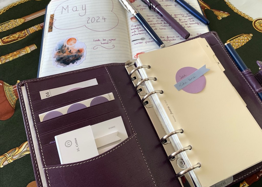
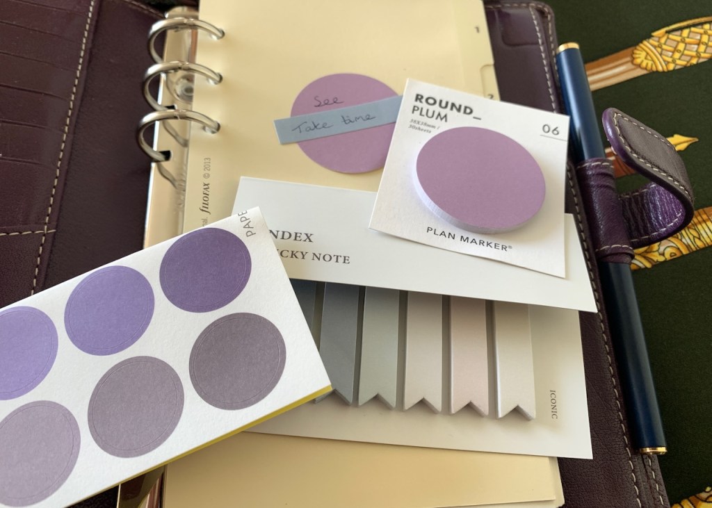
April, therefore, took me full circle and deposited me back into the Holborn. My time in the A5 space provided a few ideas to help me achieve some part of my aim to have the Holborn encourage my creative leanings. For example, I dug out the plain cream dividers which originally came packaged with this binder. The patterned plastic dividers that I had been using may seem more “creative”, but the blank canvas of the cream dividers speaks more strongly to me. So far as purchases go, I ordered some decorative paper bits online, going back to the original direction I imagined when I started using the Holborn. I found some small, circular sticky notes in a shade that co-ordinates well with the purple leather, and some gradient sticker dots which also work well with it. Then I finally got my hands on the pastel page flags I’d been thinking about in the winter, and that completes the “decorative but functional” update to the planner. I’m not fond of over-burdening planner pockets with decorative items, but it makes me happy to see these at the front of my planner when I open it. The sticky notes tolerate fountain pen ink, by which I mean that they stay just on the acceptable side of rejecting the ink entirely.
I haven’t quite got the set-up how I want it yet, but it’s getting there – evolving with each passing month. I intend for May’s “upgrade” to be the refinement of the notes pages. I have ideas about this, I just don’t necessarily have the right paper to put my ideas into practice. Watch out for June’s update because I hope I’ll have this step of the process cracked by then. I can’t entirely rule out a return to A5, either; I know the urge lurks in the background to find my “forever” binder, which would be blue and A5 sized.
My currently inked pens list for May consists of:
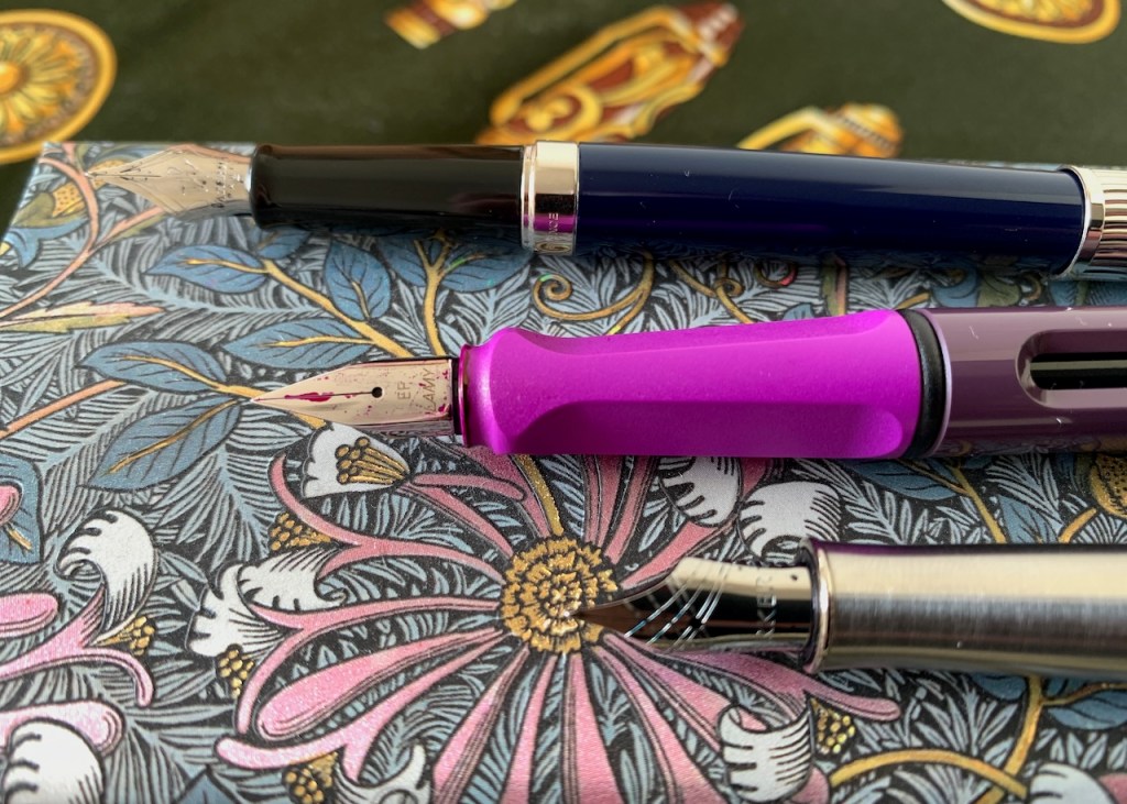
Waterman Hemisphere L’Essence du Bleu with Graf von Faber-Castell Cobalt Blue – And the exploration of my lovely L’Essence du Bleu pen continues. I enjoyed using this pen with the Waterman Inspired Blue last month and, if anything, I am getting even better vibes from the pairing with Graf von Faber-Castell’s Cobalt Blue. It’s an ink I admire deeply as it sits on the cusp between blue and blue-black and resonates strongly with my navy yearnings. The L’Essence du Bleu continues to charm, especially that rippled cap which captures both the visual and the tactile imagination.
Lamy Safari SE Lilac/Blackberry with Pilot Iroshizuku Yama-Budo – At last I have tired of the Water Hemisphere Rose Cuivre with Pilot Iroshizuku Yu-Yake and moved across to Yama-Budo as my accent ink. I think this is quite a magical pairing as it matches the berry shades of the special edition Lamy Safari and suits the extra-fine lines of the nib I have on this pen.
Montblanc Slimline with Montblanc Midnight Blue – Though there were several changes in the Filofax set-up this month, the pen survived all of them. I want no other.
Parker Sonnet with Diamine Aurora Borealis – It was time to have a head-to-head between the Waterman L’Essence du Bleu and the Parker Sonnet. Of all my pens, these seem to be the most closely matched, and it could be argued that I don’t need both (though luckily I’m keeping my pen collection at a point where I don’t feel it’s necessary to slim down, or do any kind of “one in, one out” deal with myself). I didn’t intend to ink any more pens with the Aurora Borealis as it shades rather more heavily than is my preference. Before I knew it, though, I’d inked up this pen with this ink and it’s a match made in heaven. The nib tames the ink a bit; there is still shading, but it’s less extreme than it was in, for example, the wetter nib on the Namisu Orion. Whether it’s this, or the changing colour perception that comes with the daylight as we head into later spring, but this teal-green shade is pleasing me no end at the moment. I’m using the pen a lot in my journal and thoroughly enjoying writing with it. I anticipate that this combination will see me through the month without any need to change.
Full steam ahead, then, sailing the (hopefully) sunny skies, finishing up the left-over projects from winter and watching summer take tenative peeks over the horizon to see what shape the world will be in when it arrives.

11 responses to “May 2024: What’s the plan, Pam?”
It was great to read how your Filofax planner preferences are still evolving. This was particularly relevant for me as you will recall that I hopped on the Filofax train for the first time this year, with a blue leather Personal size at an irresistible £16.00 in TK Maxx. I know I am about 40 years late here, but am finding the Week-to-a view diary section ideal for future events, and daily entries for what I plan to do the next day (always fun to tick later). I also like the To do list pages, for categories such as future blog post topics. The Finsbury now lives on my desk. As for journaling, I still use my Rymans A5 page a day.
However, my lucky bargain streak continued when I later spotted the Filofax A5 Lockwood cognac, reduced for clearance in our John Lewis – and then a few weeks later, a Filofax A5 Lockwood garnet zip version: both were down from about £115.00 to £34.50 I think, which I could not pass up, although I have not yet put either of them into circulation. I just enjoy thinking about them 🙂
Interesting reading about your switch to A5 (discbound) and back again to Filofax – weird the way the parallel planner path we seem to be on (as you mentioned some time ago) cropped up again this week as having decided a change was needed set up my WH A5 as my planner with some new inserts. Living the A5 dream lasted all of 48 hours before I was back to my Travelers notebook (A5 height but only 110 width) and feeling far more comfortable than in full A5 which puzzles me as I have always favoured A5. Like you have to see how things go as we move through the year but always interesting seeing form someone else’s viewpoint.
A5 “narrow” is a decent paper size and I can understand the attraction. I haven’t used paper A5 height but 110mm width, but I have used the inserts that Stamford Notebook Company make which are 125mm width and that’s comfortable. A lot of their A5-equivalent products including their ring-binder pages are 135mm wide which is 13mm less than a standard A5 and I find they have very nice dimensions. It’s pretty much exactly what I get if I trim off the punched edge from William Hannah paper which I often do to use in the A5 Filofax.
Interesting to read of your short move away from Filofax and back again. Eerily I also switched away frommy Travelers notebook to A5 this week feeling in need of a change. I set up my WH A5 with some new inserts and was ready to go the joy of full A5. 48 hours later I am back in my Travellers notebook feeling far more comfortable, more protable, less weight and bulk and strangely the 3/4 notebook approach I really like even though A5 is my preferred size……..but then to be fair Traveller notebook is A5 narrow at 110 wide!! Look forward to seeing how things proge=rees as we move through the year.
Apologies for the double post Pam ( and no name). I can fuly understand your liking for Filofax. I used Filofaxes for a long time and developed what for me was close to the perfect set up the only bugbear and reason for switching from Filofax was the irritation of rings getting in the way when writing. Did try taking pages out writing on them and putting them but that seemed to defeat the point of having the Filofax in the first place. So started looking at alternatives and so eventually to Travelers Notebook. Interesting point you make about trimming WH paper and getting 125mm. Might have to give that a try sounds a really good size compromise.
Charles
Thank you so much for your April blog post. You raided a good number of interesting issues. But first congratulations on those matching purple post-it notes. How I enjoy the way you are able to match up your pens, binders and accessories.
From day one just over a year ago ive used A4 filofax to write my daily journal. I take the paper out to write and i dont mind that.
But likely Scot Fizgerald I was glad to arrive at 30th April as i was having problems with every pen I used. Thinking it was the pens I started attending to the nibs with some mixed results. Then I realised it must be the Diamine Celadon Cat ink. A lovely shade but, like you, too much shading for me. Far too dry.
But your blog also put me in minf of the Stamford paper company whose paper is lovely. I rang them today to ask if their 6 hold loose leaf paper fits filofax but they didn’t know. If it did, i’m thinking of going over to their paper as the stuff i’m using is to toothy.
sorry for the rather long personal story but thank you again for your blog. It is heartening to know that, even further down this pen/paper road than me, you are still trying to work out the best way forward.
tim
i
Hi Tim, thank you so much for taking the time to mull over my April blog post and come back with your comments. The post-it notes are lovely, the right colour and also a size that really suits the personal Filofax pages. I hope your pen woes have settled down; I am enjoying mine so much more in May than I did in April. I am pleased to say that I used one of the Stamford Notebook Company diary refills back in 2021 and it fitted perfectly on the rings of my A5 Filofax. You can see it in action in my blog post from December 28th 2020. I hope that helps in your decision-making.
Pam, A quick thought you may or may not have heard of Crossbow Planner Co UK – Have a range of Filofax covers, prepunched inserts and printable inserts that might be of interest. Have a nice long weekend. Charles
Thanks, Charles – that’s very interesting. I had come across Crossbow as selling printables, but the I’m intrigued now I’ve looked at their pre-printed offerings. There is definitely scope for a try-out there.
I thought I would be done with both my Lamy safari aquasky and strawberry red for the month of May and to get onto another brand other than Lamy and found myself with 2 new purchases of used Lamy CP1 pens which means another month of Lamys.
Ah, I’m currently using my Lilac Blackberry Safari to wite my journal every day, so I am with you on the Lamy train. I’m finally embracing the fact that there are a few pen brands which speak strongly to me and I’m going to concentrate on those. I love looking at what other people own or collect, and keeping abreast with all the new things being released, but certain brands will call out to me more clearly than many others.