I should be enjoying this ink more than I am. There, I’ve admitted it and now I can relax. Don’t get me wrong, it’s a lovely shade and I’d be inclined to suggest that people who hanker after the discontinued Lamy special edition Dark Lilac should really check out Scribo Notturno Viola. Also, anyone who needs an ink which could almost be black, but isn’t, would also be the ideal target audience. For my own tastes, it is just a bit too dark, a bit too dense, perhaps even a bit too subtle.
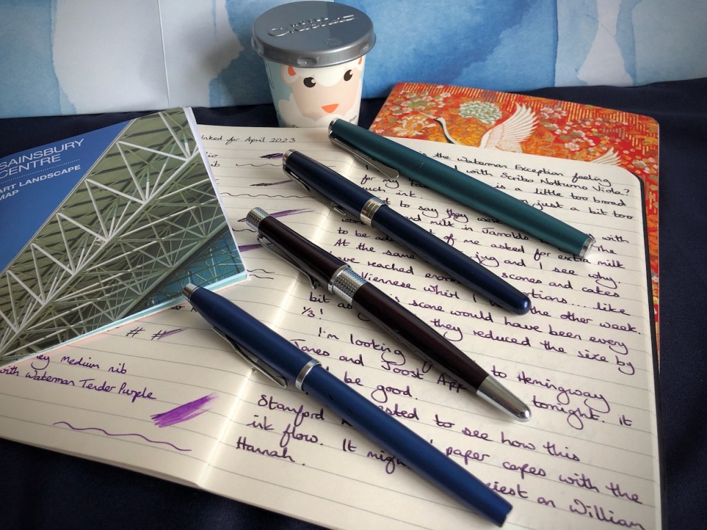
One of my chosen pens for the month has now officially fallen by the wayside, been sent to the bench for the remainder of the game, put on gardening leave. I knew as soon as I got home and tried it out after the Autumn Pen Show last year, that my prized Waterman Exception’s Medium nib was not the nib of my dreams. To my eye, it leans towards a broad stroke which doesn’t suit my handwriting at all, or, more accurately, doesn’t make me happy with my handwriting. Comparison below shows the Waterman Exception at the top of the page and a sample with the fine nib of my Parker Sonnet below, on William Hannah paper with 8mm line spacing.

The problem I have with the broader nibs is that they remind me of writing with a felt-tip pen – something along the lines of the old Papermate Flair pens. These are still going strong, by the way, though I haven’t used one in years.
The Exception isn’t going anywhere, it is still a beautiful pen which I’m happy to have in my collection. However, it is a candidate for professional nib-work in the future so that it can be turned into something perfect for me. For now, though, my line-up for the rest of the month will still include four pens as the new Cross Beverley will be allowed to come out and play more than it has for the first half of the game.

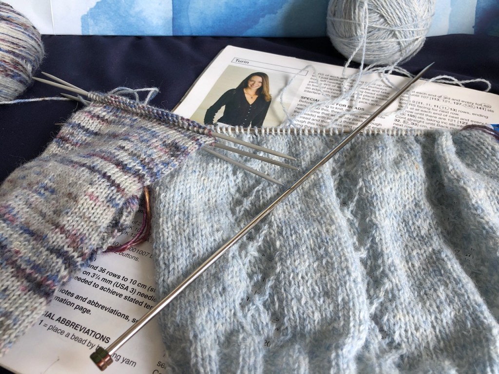
Another thing I should be enjoying, but am definitely not, is my choice of project for the BC Garn Organic Shetland wool. I don’t like the needles I am using at all – the wool is too grippy and the needles are too heavy in the hand. More than that, though, I’m just not feeling it. The project is, on paper, exactly the right thing to be making, but it doesn’t stir any kind of chimes in my heart, and so a re-think is in order. I won’t say that starting the Turin cardigan has been a mistake, since every cloud must have a silver lining. In trying to avoid picking it up and working on it, or making the decision to rip it out, I have been busying myself with a new pair of socks.

The wool I’m using for this sock is Rico Vintage in a pleasing melange of greys, blues and purples. This is a “use it up” project with the joint purposes of getting a ball of yarn out of my stash and completing the second of the six pairs of socks I’ve promised myself this year. When I previously tried to knit this yarn I wasn’t impressed. So far this time it’s going well, so I think I’ll press on and finish these whilst I ponder what type of garment that pale blue wool is yearning to become.

7 responses to “I should be…”
I can’t see anything to dislike about your writing with the Waterman Exception. I appreciate that it is on the broad side but it can be nice to have such a nib, as they are often smoother than fine nibs, better at showing off the ink colour and any shading and better at riding over laid paper.
Ah, the Papermate Flair. Weren’t these previously called Tempo pens or am I mistaken? They seem to last for years and I vaguely recall that Jeffrey Archer wrote novels with them.
They were called Tempo pens. No idea why
A felt-tip pen is Tempo-rary, but a fountain pen is for life.
Great answer it should have been obvious
I’m glad that the things I dislike about my handwriting with broader nibs aren’t obvious to the casual observer. I think it’s the density of the writing on a page which determines whether or not I’m happy with the result. At the end of the day, I have found my comfort level with the types of nibs and papers which make me happy, which allow me to use my fountain pens for the types of writing I like to do, and which afford me a certain amount of variation when I want it. The Exception’s nib, for me, just wanders a little too far off the track. One of the reasons for inking up the Exception was to see if I felt the broader nib showed off the ink better than my finer nibs, and I can’t see it with this ink, but it’s not an ink with great shading properties.
To me your hand writing, Pam, seems so tidy. Maybe you will give your Waterman Exception a ‘run out’ in a future month with another ink just in case.
There is little doubt in my mind your beautiful subtle light blue wool will call you back at some point. It looks so lovely. As someone who suffers from cold feet all year round – socks are surely a priority. I’m sure your right to focus on them. .
Oh and i forgot. I love thevwashi tape. Does that not match your journal cover?