

Have you noticed how all the planner people decorate in lovely bright shades of green for March on account of St Patrick’s Day? I was going to decorate the March horoscope synopsis in my journal with these spring green stickers, then didn’t feel like it. So, here they are adorning April instead.
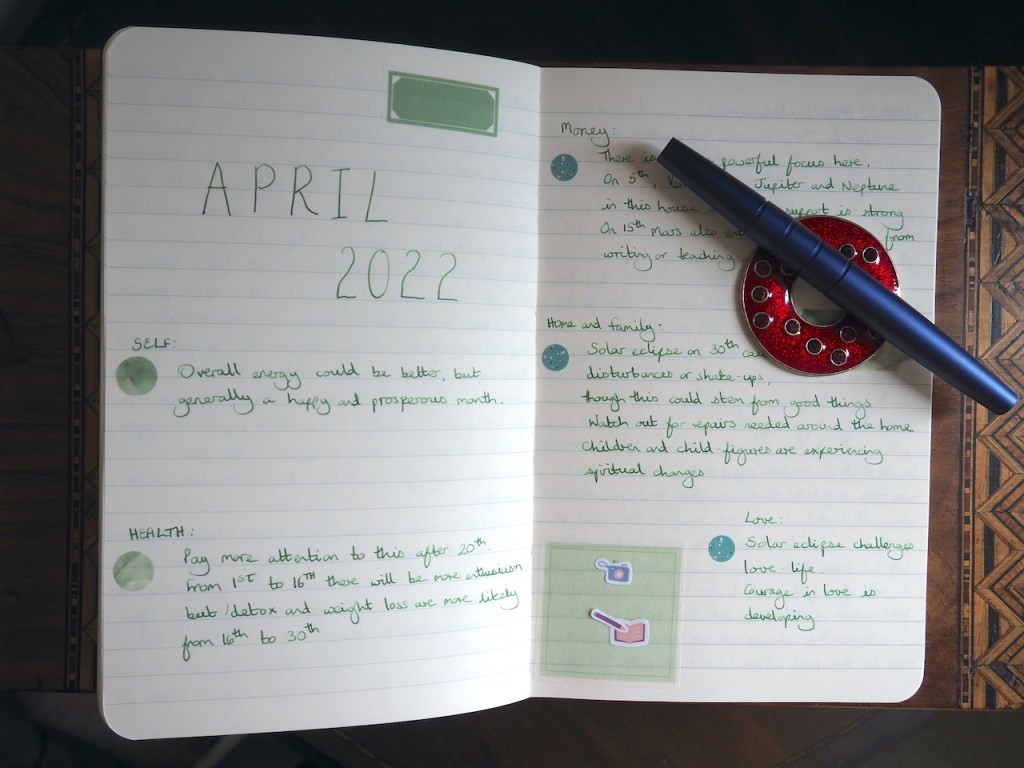
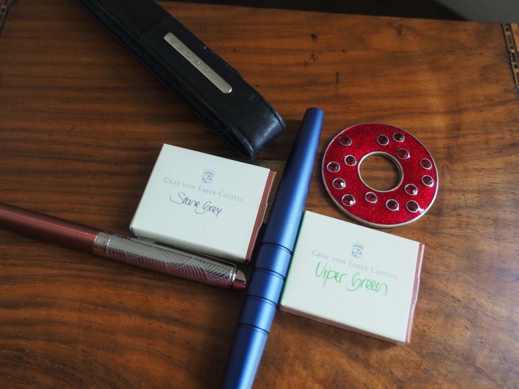
I decided I’d go with a spring green ink, too, at least for writing my journal. I filled up the Namisu Orion with Graf von Faber-Castell Viper Green, but it’s just not hitting the spot for me. I know it’s a lovely, bright colour and totally befitting the season of leaf buds, chicks, daffodils and Easter Eggs, but my eye doesn’t seem to be drawn in that direction yet. Maybe the problem is that I’m still using Electric Pink as the accent colour in my journal and these two are not a happy pairing: they are too similar in vibrancy yet don’t complement each other at all. Perhaps I need to pair this shade of green with a very muted colour, which leads me to wonder whether Stone Grey might be the answer. It never has been before, but there’s always a first time. I’m not, it has to be admitted, a fan of grey inks, though I always think I will be until I actually use them. Graf von Faber-Castell’s Stone Grey is a really good pencil-lead grey which is great if you happen to be a fan of pencil lead. Anyway, I’m going to give it a spin on the basis that it will be an improvement on the Electric Pink when sitting with a page of striking green words.
The last of my current pens is filled with Diamine Majestic Purple and this is the shade I’m using in my planner/diary. Luckily, this is where that Electric Pink ink really works its magic as a contrast colour. I’ve decided to stick with purple ink in the diary for the rest of the year which should reduce my stock of purple inks a little. I’m very close to emptying the bottle of Majestic Purple and then I’d like to work my way through Diamine’s Pansy which will just leave me with a bottle of Waterman Tender Purple in my collection. I sometimes dream of having just a handful of favourite ink colours and, whilst I still enjoy looking at all the shades other people are inking up, I try to be a bit aloof about the inks I will try. I find it can be useful to hem myself in with all manner of rules so that I don’t end up with more ink than I can accommodate. Another inky idea I’ve had recently is to start adding small decorative flourishes to my diary and journal using a complementary ink instead of defaulting to washi tapes and stickers. Now, my skill level being what it is, these will be limited to ruled lines and the occasional little curlicue, but things may improve over time. Mind you, I don’t need to start that until I’ve run out of washi tape, which won’t be happening any time soon.
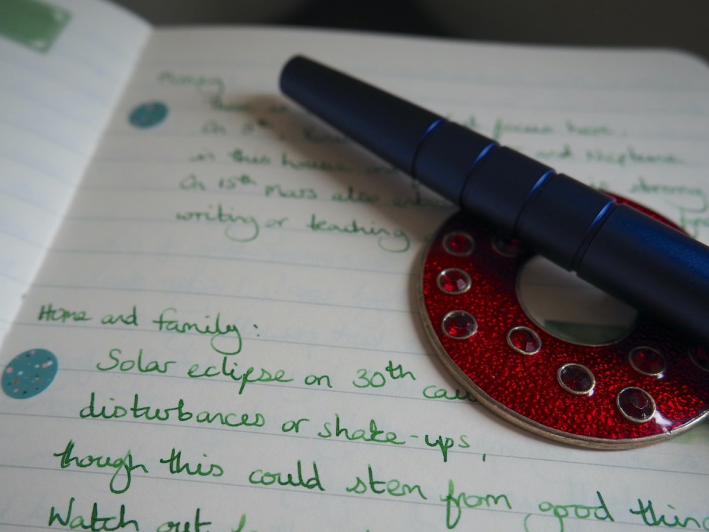
By the way, I’ve been on the search for a pen rest the past couple of months. Something that a fountain pen could balance on for photography, which would hold it in place as pens are inclined to roll when they are not firmly grasped. A little ashtray would have been ideal. Yet nothing has seemed quite right until today when I pulled that red disk out of my jewellery box. The little glass gems stand proud of the surface providing furrows that the pen can rest in and it worked well for these photos so it could be a solution.

One response to “Aquarian April”
[…] Aquarian April – Pam Alison Knits […]