


It struck me earlier this month how very long it is since I’ve worked somewhere with a proper walk-in stationery cupboard. That sit-com stalwart is gone and has taken with it the unique aroma of pencils and paper and glue, typewriter ribbons and stamp pad ink, all overlaid with the metallic accents of bulldog clips and staples and a ghostly waft of Aqua Manda and Brut. I dream that somewhere there lies an office that no-one has entered for fifty years with a stationery cupboard where all of the paraphernalia we have loved and lost lies quietly waiting for us to reclaim it. Perhaps that is where they mean when they talk about heaven.
We’re heading towards a new month, so I thought I would take a look at what’s been inhabiting my pen case in January. I’m thinking of doing this towards the end of each month. Being a bad pens-in-use logger, I have to flip back through the pages of my daily journal and my diary to remind myself of exactly what I used, although the three in use right now are easy as they live in my pen case.

I like to keep my go-to pen on the left as I pick up the case and flip open the lid. This is the pen I use to jot quick notes and to write in my diary. For the first three weeks of the month it was my dad’s old Parker 51 filled with Diamine Majestic Purple ink. I’ve really been enjoying purple ink this month, so much so that when I wrote the Parker 51 dry I brought my Cross Century II straight into play filled with Waterman Tender Purple. You can see the difference between the slightly deeper Majestic Purple and the very minimally pinker, brighter Tender Purple when they are side-by side, but the overall feel is very consistent. I particularly like purple inks set against a creamy paper like that in my Stamford Notebook Company diary, the look is opulent and very much in keeping with my interpretation of my word of the year. As to the pens, well the Parker 51 pen is a joy because it just works. Despite being feather-light, it’s comfortable to hold, writes like a dream, and I never experience any hard starts or skipping. Perhaps what I really need is to employ someone to use my pens for forty years before I pick them up. Or is that just called vintage shopping? The only thing I don’t like about the Parker 51 is that it’s a bore to clean out thoroughly. The Cross Century II remains a firm favourite, and I’m going to come back to this a little later.
In the middle of the case I keep a contrast pen: my good old workhorse Waterman Hemisphere and the Graf von Faber-Castell India Red ink have seen me safely through the month. The surface colour of this pen is becoming increasingly chipped which makes me sad in one way (it’s such a lovely shade of blue that it’s a shame to see it marred), but also makes me happy because it pays testament to how well-used and well-loved this pen has been. As to the ink, I’m still enjoying this warm, muted shade of red compared to the brighter, livelier reds in my collection.
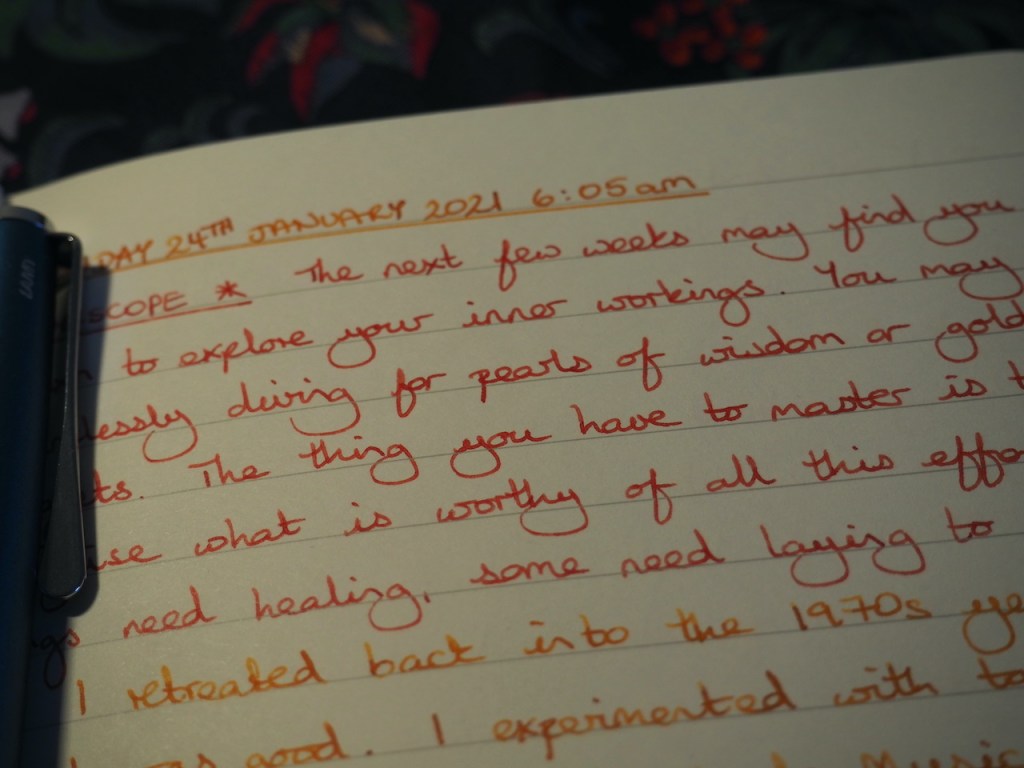
The right-hand slot of the case is home to the pen I’m using in my journal at any given time. I’ll happily pick this one out and use it for other things, but primarily it’s there for my morning journal sessions. I wrote dry my Namisu Orion/Graf von Faber-Castell Gulf Blue combination during the entry on Tuesday 11th January and replaced it with the Parker Sonnet filled with Waterman Inspired Blue ink to do a direct comparison of the two inks. This wasn’t a happy pairing. I’m still in the getting-to-know-you phase with my Parker Sonnet and that really hit home when I used it with this ink. I quickly set it aside and filled my Lamy Studio with Diamine Honey Burst which has definitely hit the right spot. Whilst Honey Burst isn’t dramatic on the page, it’s warm like a candle flame and I enjoy watching the script form as I write. The contrast isn’t great against the India Red ink which I use for the part of my daily journal entry where I write out my horoscope. I might carry on with this combination, but I think the honey and purple might be rather more pleasing visually.
An honourable mention must go to my Waterman Allure which has been drummed into service as my work pen of choice. I’m taking the opportunity to work in the office for a few weeks, with the option to mix it with working from home when I need to. It’s been a relief to get away from having to lug the work equipment home with me as happens when I rotate between office work and home work through the week. I’ve chosen to use Graf von Faber Castell Gulf Blue ink in the Allure because it plays very well with the diary insert in my A5 Filofax. This has also been pressed into service for work purposes where it provides a bit of clarity and relief from the remorseless screen-flicking which modern office work involves. Oh, for the days when you just had Word open on your single monitor, the paper copy you were typing from propped on a stand beside the screen, and a wire-bound notepad.
The number of team members in the office varies from day to day, but yesterday there were a reasonable number of us in and I was surprised when we held an impromptu fountain pen “meeting”. One of my colleagues showed me her new Parker she’d treated herself to – a lovely IM in a textured grey finish. The IM is one of Parker’s designs that I do like (some, like the Urban, don’t appeal) and the Last Frontier collection of IMs is definitely calling to me. I even like all three colourways in this recent collection which is unusual. Anyway, back to my colleague. In her stationery pouch she also had a couple of fountain pens she had received as gifts which she loves to use as well as two Pilot V pens, the fountain pen equivalent of the ballpoint, which she uses extensively in her studies. I showed her the three pens in my pen case and she tried each one out. Care to guess which one was the standout from her point of view? Well, it was the good old Cross Century II. It isn’t trendy and it isn’t attention-grabbing, but there is definitely something about that pen. Another colleague was telling us that he still has a Cross fountain pen and ballpoint set which he bought to celebrate (I think) his graduation. We were encouraging him to get it out and ink it up as he has the converter and a bottle of ink.
Which all goes to show that, just like rats, fountain pen users are all around us even if we don’t notice them until we look.

2 responses to “Pens in case: January 2022”
I like the look of the purple ink.. At the moment i am using Diamine Writers Blood, Pumpkin and Oxford Blue plus a bit of Kelley Green for accent. I don ´t write as much, just logging my perfume and my meals in my bullet journal. I do not have many appointments or things to note for later, just go to work and see one patient after another. And with this pandemy still going strong, there is not much to do on weekends too. I hope this will change with better weather and more outdoorsy things to do.
[…] Pens in case: January 2022 – Pam Alison Knits […]