

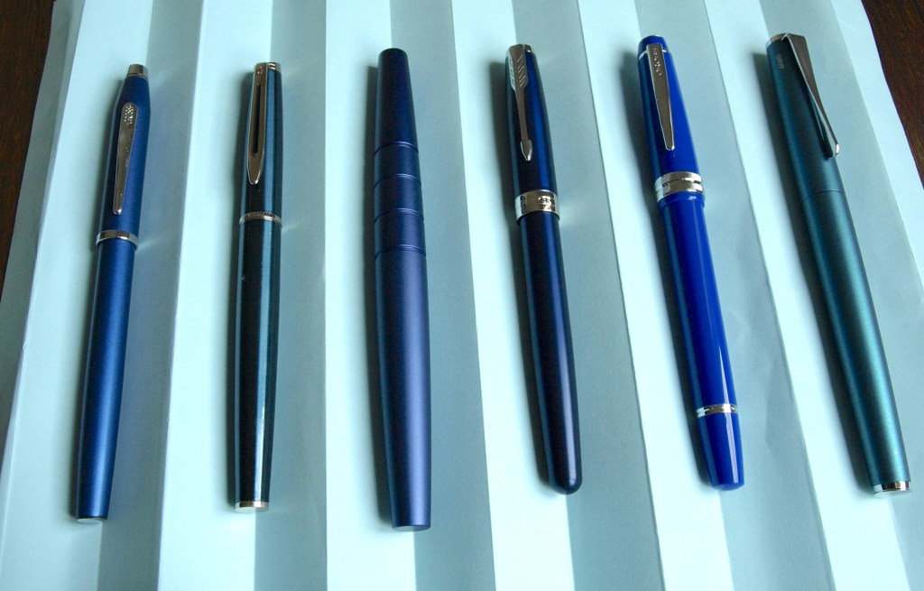
I know I left you in my previous post with a tantalising suggestion that I might not have simply bought another blue, metal-bodied fountain pen with chrome trim, but I will tease you no longer. I dreamed of breaking out of this incredibly narrow field of choice, but found myself reverting to type. What can I say? I know what I like and, in this instance, what I like is a Parker Sonnet. Can you spot in in amongst Clan Bluepen here? Not exactly standing out, is it?
The Parker Sonnet is a design I’ve had on my radar for a while now, purely through admiring the lovely red models that Waski Squirrel shows in his Pens in Use videos. It’s such a lovely classic design and, to my eye, it is the epitome of what a fountain pen should look like. Fitted with steel nibs, these run at the very top end of my pricing comfort zone – around the £100 mark give or take. Fitted with gold nibs they now exceed £200, which is well into my personal discomfort zone. In the most up to date versions of the design, the steel-nibbed version has a plastic section and lacquered cap to match the barrel whilst the gold-nibbed versions have a metal section and metal cap with an etched design. The silver and gold model is particularly eye-catching.
Whilst I was very taken with the Sonnet, my previous experience with one of Parker’s more reasonably-priced steel-nibbed models (the IM, I think) didn’t inspire me at all. Knowing I’d only want to buy a gold-nibbed version, I contented myself with admiring the Sonnet from afar. Until last weekend.
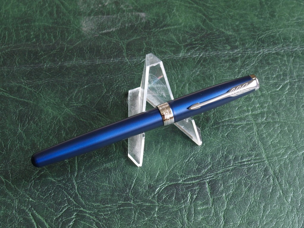
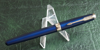
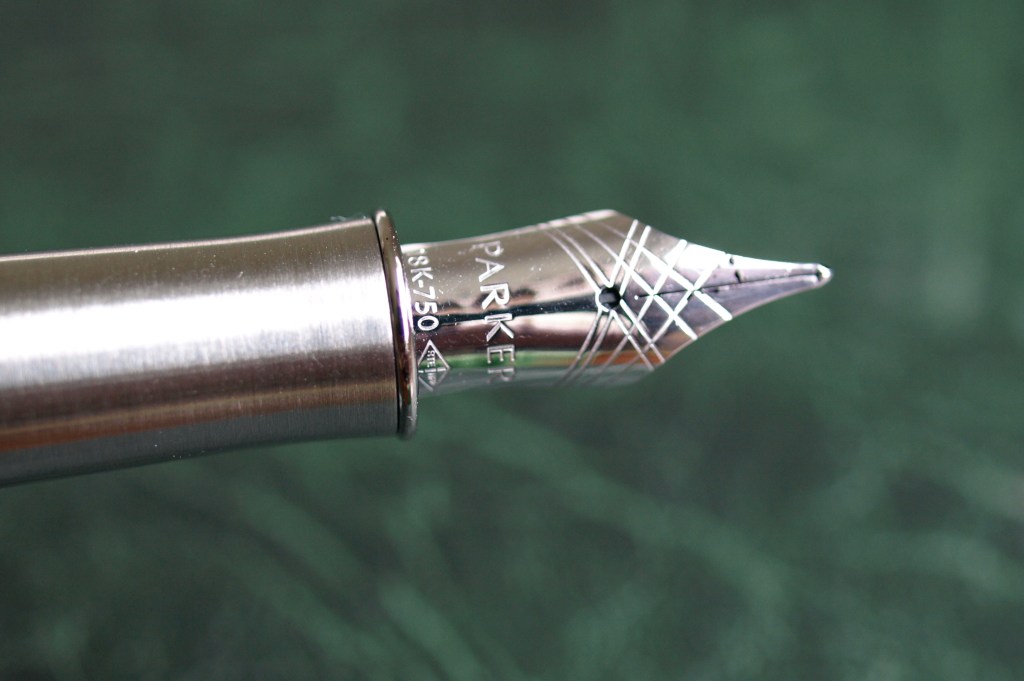
So, what exactly is my new Parker Sonnet? Well, it’s a metal-bodied pen in a blue lacquered finish with chrome trims and a lacquered cap to match the barrel. Uncapping it we find a metal section and Fine nib in 18kt rhodium-plated gold. This is an older iteration of the gold-nibbed design and the reason for my purchase was that it was going for a song in what I expect is an autumn clear-out of stock. I paid a shade less for this than the full-priced steel-nibbed versions are currently selling for. When the Fates stand in the corner of your room and throw such a bargain your way, only the foolhardy try to resist. Okay, it’s blue and chrome and I have blue and chrome fountain pens coming out of my ears, but this pen couldn’t have shrieked my name more clearly if it had been engraved with “PamAlisonKnits” and had a neon sign flashing over it saying “This is Pam’s pen”.
You know me well enough now to understand that I’m not going to give a technical review of this pen, though I’m sure you can find such things if you search the internet. Instead, my impressions are touchy-feely and boil down to the fact that this is a nice pen. In looks, it reminds me strongly of the Cross Bailey Light, with that same subtle corporate look – this would be at home in a boardroom. In fact, if I were to practice the art of one-in, out-out, the Cross Bailey Light would be going out because I’d consider the Sonnet very much as an upgrade. I need to ink up the Bailey again so that I can see for myself how they compare head to head.
Going beyond the looks, I do like the weight and balance of this pen, how it feels in the hand. It is still relatively light-weight which is good for longer writing sessions, but the metal section gives a bit of solidity in the hand. The section also helps to balance the pen if you post the cap when you write – I’ve read reviews of the steel-nibbed version which say it can be a little back-heavy when the cap is posted, but I think the metal section resolves that issue.
A converter was included with the pen which is a nice touch, and I initially filled it with Diamine Pansy ink after a very quick rinse to clear any residue. On the first try the pen seemed nice to write with, however when I wrote a whole journal entry the following morning I found the nib had a tendancy to skip on downstrokes – specifically, on a “t” or “l” at the beginning of a word. Last night I emptied it, gave it slightly better flush, and put in the cartridge of black Parker Quink which had also been provided in the box. This did not resolve the skipping problem. This morning I put a bit more effort into it and disassembled the parts to give them a good clean. This is made delightfully simple by the design. The nib and feed unscrew from the section and the nib then unclips from the feed. I gave the components a quick bathe in water with a tiny drop of washing-up liquid, rinsed them and dried them then reassembed the pen and reinserted the cartridge. Success! It’s not quite perfect, but the vast majority of the skipping is gone and I am confident the odd skip will be eradicated by the time I’ve written with the pen for a few days. I don’t count this as a glitch as it’s not unusual to have to give a pen a good clean in order to get a fair idea of how the writing experience will be.
This aside, I think the nib is really nice. It is a fine and I do have to remind myself that I often opt for an extra-fine so I can’t compare it with some of my favourite nibs. It feels nice and smooth as it glides over the paper and it has that slight amount of give which you find with gold nibs and which makes writing with them very pleasant. I do need to give it a good run so now the skipping is sorted I will write some journal entries with this.
Are there any regrets? No, none at all. If the red-bodied gold-nibbed version had been available at this bargain price I’d have leapt at it, but the blue is a very close second and I’m certain it is a better choice than opting for the red-bodied steel-nibbed model. If anything, adding this pen has helped me to realise that I am heading towards thinking of my fountain pens as a collection and it has me considering how I store or display the pens I own and the interesting accessories of the hobby.
Now that there are unlikely to be any more Blakes 7 fan conventions that will entice me, I am coming round to the idea that I may replace those with an occasional trip to a pen show. I enjoy reading the write-ups from the bloggers I follow after they have been to pen shows (indeed, I’m avidly awaiting their thoughts on the show that has been running in London this weekend) and that is a sure sign that I’m gearing up to enter the arena myself.
So now it’s over to you. What do you think about me adding yet another blue and chrome pen? Is it one too many, or do you appreciate the subtle variations in colour and design every bit as much as a whole rainbow of colours, shapes and sizes?

8 responses to “Why I bought another blue pen”
Congratulations on your new Sonnet! It is especially pleasing that you picked up the gold nibbed version, with the weightier grip section, at a favourable price.
I would not worry about the skipping: it probably just needs writing in to your angle, to form a flatter surface on the tipping.
Thanks, I think it fits in very well with my little collection and I’m looking forward to trying a selection of inks with it to see if it has a lifelong partner or ends up being rather inkmoral!! Hope you enjoyed the fountain pen show.
Yes a great day out at the London Pen Show today. I managed to limit myself to just three pens, all great bargains, plus three inks and a spare nib in Titanium which I am playing with this evening. I shall probably do a post when I have time to gather my thoughts!
Ooh, that sounds lovely. I’ve pondered the Titanium nibs which Namisu do on some of their models so I’d love to know how you get on.
Beautiful. You know how I love runs of things subtly changing shade so this is perfect to me. I’m expecting as you extend this passion you will run through from the blues to purples, lilacs and on to the reds and pinks, so be warned your display plans need to be extendable.
Ah, purples are a challenge, but I realise now I may have been hasty in my inclination to leap straight from blue to red!
A very nice looking pen indeed. And every blue is different. I never owned a Parker. My only ancient gold nib is a montblanc Classique that I bought in the 90ies. I should have gotten a fine nib instead of the medium, because I don’t like to use it.
Indeed, the different shades do make the collection more interesting. I believe my Dad’s Parker 51 has a gold nib, though I’m not brave enough to disassemble it to find out. Interesting about the Montblanc Classique.