

I headed into the city this weekend to look for a new notebook to use as my daily journal and a few other odds and ends. Perhaps (who knew?) to saunter in the sun, sit and drink a cup of coffee in any one of a number of decent tea or coffee shops, scope out what the stores had to offer. I know myself, though, and my limited capacity to enjoy such jaunts, especially in the height of the busiest part of the weekend. I was fully prepared to be rushing home with my hands over my ears before I’d even scratched the surface.
I did quite well as it turned out: looked at about half of the things I had on my list, bought the essentials, and deferred decisions about the other half. I will admit that overspending in one sector had me postponing my proposals for another sector or, as I like to think, buying me extra time to savour the delights of the period where I dream about owning something before the heavy reality of actually owning it sets in.
It wasn’t stationery where I overspent. Anyway, it isn’t overspending if you simply buy items earlier than you needed to in order to get some freebies. No, it’s wise money-management; it’s forethought; it’s… spending money on stuff you don’t actually need right now but in a way that makes you feel righteous instead of wrongteous.
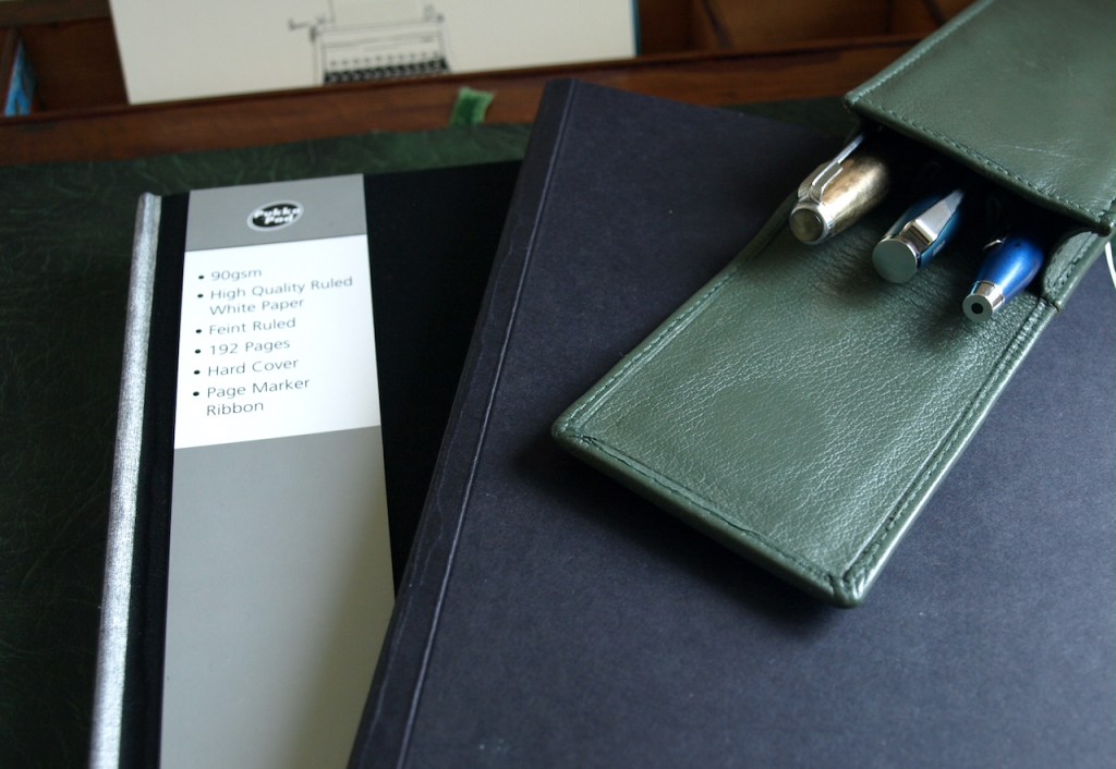
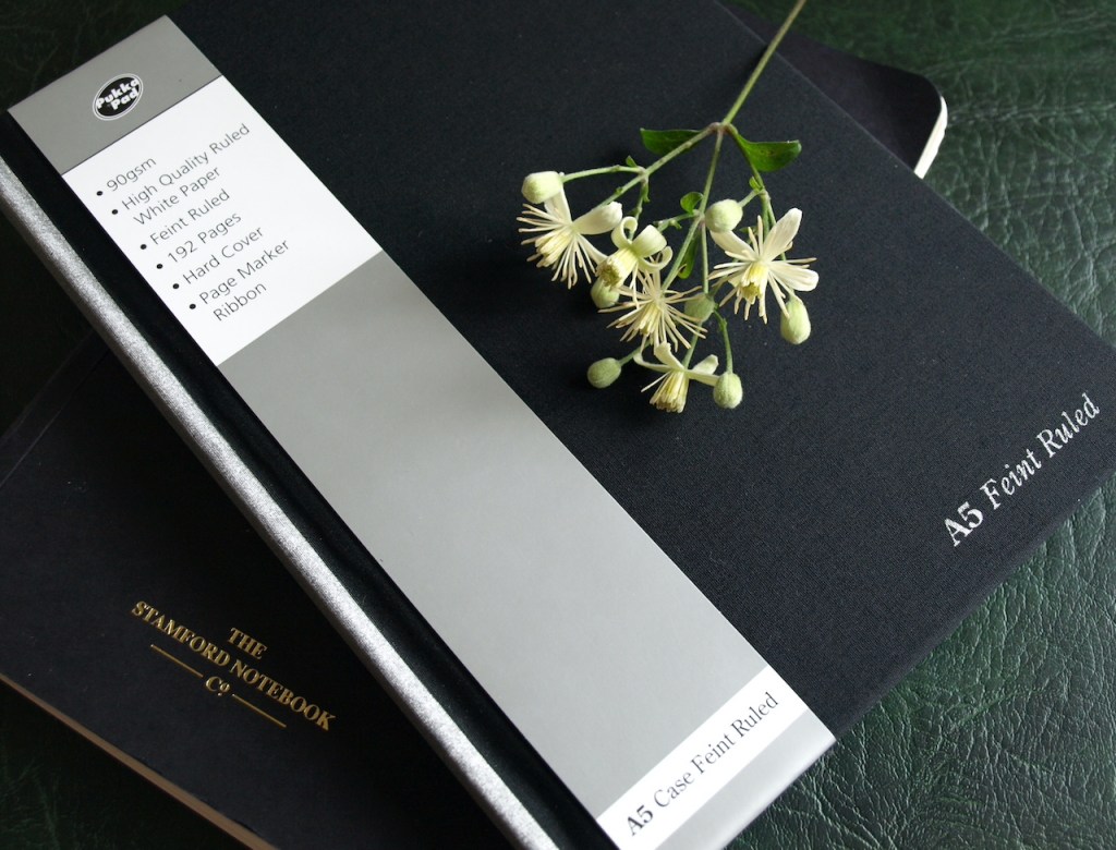
Although it wasn’t stationery where I overspent, it is stationery on which I want to focus today. Specifically, the hard cover, A5 Casebound Pad by Pukka Pad.
You can see the specification on the paper band and the details suggested that this might be a decent book, though paper quality, being subjective in the extreme, is notoriously difficult to determine from any details that can be written down. What I will say is you can often get a helpful nudge regarding the paper quality from (a) the listed details and (b) a quick check of how it seems to the touch. In this instance both of these guides led me to feel hopeful, especially when compared with a book from another brand where the paper was 80gsm and felt significantly less substantial.
It took a little while for this book to my grab my attention as it was on the very bottom shelf of the stand, almost hiding away for fear of being noticed, and when I did see it I almost dismissed it out of hand as I really didn’t want another book with a black cover. In fact, the one I was making a strong case for was the Letts Legacy Notebook, available in a variety of cover colours including a very nice purple. Two things swayed my judgement. First, the book from Letts was rather smaller than the standard A5 of the one by Pukka Pad. My current journal, the Stamford Notebook refill, is about 12mm narrower than a standard A5, but the Letts notebook was similarly narrow and also shorter. Now I’ve checked the full details online, I see the Letts notebook has 240 pages compared to the 192 of the Pukka Pad notebook, so that does even things out a bit better. However, the Letts notebook was priced at £20.00 whilst the Pukka Pad notebook was £5.00. Getting through them at a rate of one every 2-3 months does make me conscious of my budget and this was enough to steer me to the cheaper version, not to mention the fact that it’s one I haven’t used before and I like to try out the different papers.
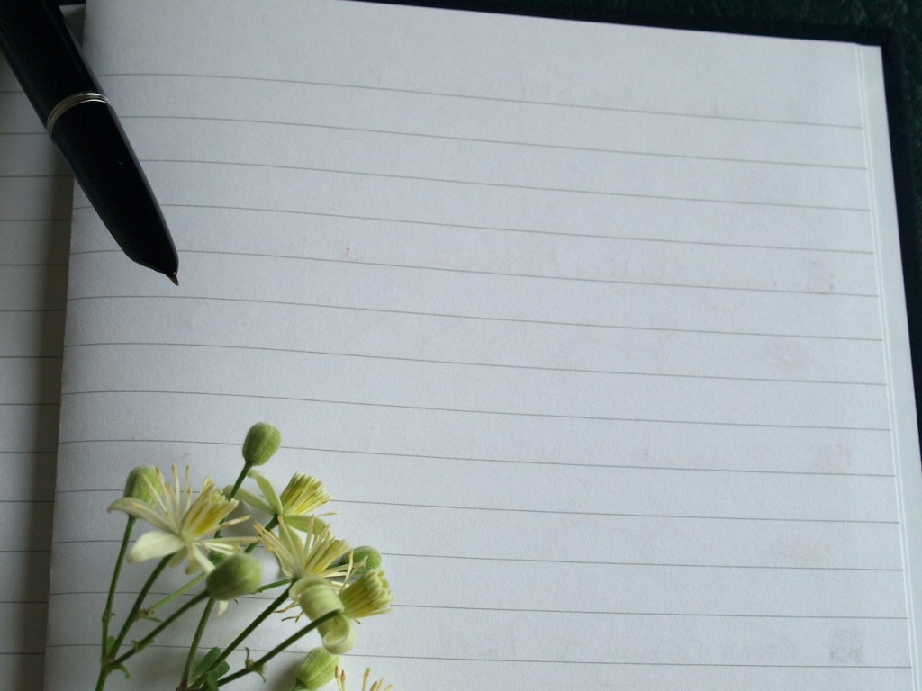
Suffice it to say that I don’t (yet) regret my purchase. I did a pen test when I got home and, whilst there is a bit of bleedthrough with some inks, it is at the level of occasional flecks, not whole letters and words seeping through to the back of the page. Showthrough/shadowing is barely visible, so top marks there. The paper is a pleasant white rather than the ivory/cream in my current notebook, but I am pleased that the line width is similar across the two books. The Pukka paper is more absorbant than that in the Stamford Notebook which is a double-edged sword as some pen and ink combinations give their best on very slick paper whilst others really come into their own when they are able to spread a little into the fibres. I anticipate my combination of Graf von Faber-Castell Gulf Blue with my Namisu Orion pen is going to love this paper. The same goes for the Graf von Faber-Castell Burned Orange currently in my Diplomat Traveller – I have been intending to flush this out as I wasn’t all that impressed with the combination, but I love how it looks on this new paper. In fact, a combination of Gulf Blue for the main writing and Burned Orange for my daily horoscope may be my go-to as I begin the new journal in a couple of weeks time.

As you will see, although this paper encourages ink to spread slightly, there’s no noticeable feathering. I expect this would happen with broader, wetter nibs, though. Of course, the thing I don’t know is how friendly the Letts paper would have been with my pens and inks. I think it would have been quite good, as they do advertise this Legacy range as being suitable for fountain pens. Perhaps next time I’ll go for the Letts notebook. After all, I will be buying it around the time I start thinking of Christmas treats for myself.
Since my slightly underwhelming browse for a suitable notebook, I’ve been pondering the changes that have taken place at Jarrolds of Norwich in my lifetime and whilst I still think I am incredibly lucky to have such a magnificent independent department store pretty much on my doorstep, I lament the loss of some elements which I knew and loved in my younger days. When I was growing up the firm was still pretty widely known as Jarrold The Stationers and the premium ground floor space was largely devoted to a stunning book department and general stationery, as well as a beauty department and lovely handbags. A separate shop across the lane from the back of the store housed Jarrolds Office Equipment which, in the 1980s and 1990s, even sold computers. The firm were as well-known for their printing business as they were for the shops, and produced many glossy colour guide brochures and calendars.
Moving into the modern world, the printing business has gone and books and stationery are down-played in favour of perfume and cosmetics, handbags, and aspirational fashion for men and women. You can still shop for the good old items, but you have to look harder for them. The book department is hidden in the basement, which once housed an enviable china department where my mum would shop the seconds at sale-time. Whilst fountain pens are categorised alongside jewellery and watches and allowed prime real-estate on the ground floor, what remains of the personal stationery department is now up on the third floor with toys (Jarrolds’ toy department has always been superb), a small selection of craft materials, and the main restaurant. The majority of this stationery leans towards the pretty rather than the functional – Instagram stationery to suit their target market – and the department is strongly focussed on cards and gift wrap.
This leaves the functional stationery banished to the old Office Equipment shop which it shares with the art supplies that used to occupy a large section on the third floor. I think if all of the shop’s stationery (pens, Instagram-y and functional) was together and partnered with art supplies, it would make sense to me, but then it would need a larger area than they have available. Anyway, the functional stationery area seems disorganised and lacking motivation; I think it has lost its way. It feels like the products have just been allocated a temporary home and made the best of it, instead of being displayed to attract customers. It makes me a little sad because I don’t think it would take too much investment to make it more aspirational. A few years ago they had a good stock of Rhodia as well as Leuchtturm and other, more basic, paper brands. Leuchtturm remains because the Instagrammers like Leuchtturm, but Rhodia has gone. They still have a display of Filofax binders and inserts, more than I see in my local Rymans, about the same amount as our John Lewis store. There is, of course, a decent display of ballpoint and rollerball pens, back to school stationery, and assorted items that I can’t deduce the purpose of which gather together in unwanted and unloved piles in random corners.
I hope the future brings the pendulum back towards books and stationery and the strategists pick up on the fact that the desire for high quality paper, pens and inks is not limited to old fogeys like myself. In the meantime, I’m dreaming of the days before I was born when there was, apparently, a subscription lending library in the department store. Now I could get behind that. If that appeals to you, too, why not take a look at the excellent history on Jarrolds’ website?
Well, that’s all folks. The working week starts tomorrow and I’ve got lots of little chores to get out of the way ahead of that. I hope the weekend has refreshed you and set you up for your coming week.

3 responses to “But is it friendly?”
While the Jarrolds china and cookware department has shrunk considerably, we have always followed Mum’s example by buying all our china, pots and pans in their sale. We spent the year choosing what we’d want, saving up and Jarrold’s sale was our mainly January, occasionally July treat. Is it a good thing that now we really couldn’t squeeze much more into our tiny house the choice has become limited?
Yes, I bought all my Portmeirion china in their sales. I invested in a relatively expensive tea strainer yesterday – £3.50. I think the profit from that and the £5 notebook should fund a revamp of the stationery. I need a new omelette pan.
[…] But is it friendly? – Pam Alison Knits […]