
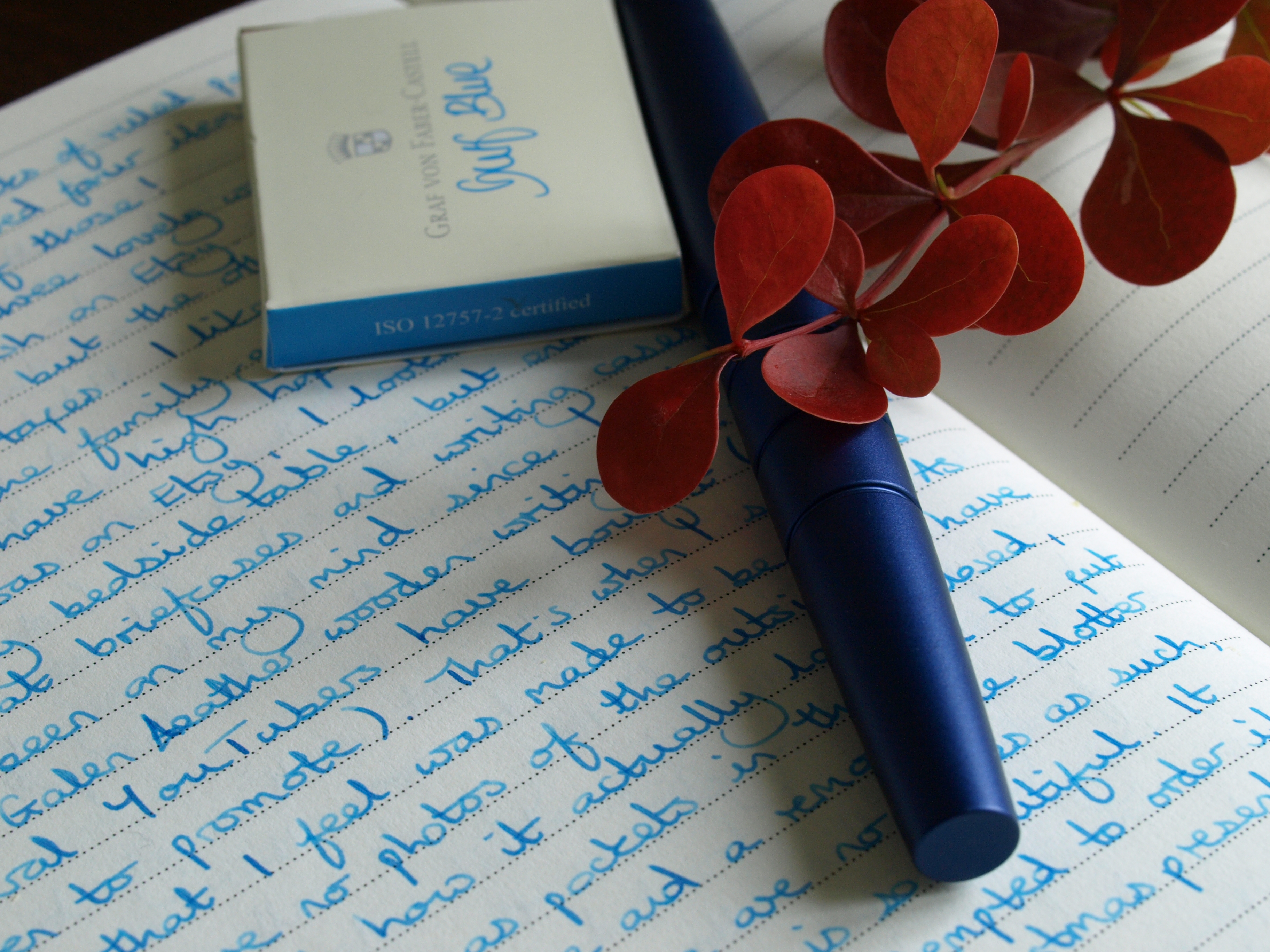
Isn’t it strange how things can find the chinks in your armour and before you know it come creeping into your affections? Take this Graf von Faber-Castell Gulf Blue ink, for example. After my first try it was easy to dismiss the shade as too wishy-washy, utterly failing to hit the jewel-bright tone I favour. How was I to know that it would worm its way past all my defences?
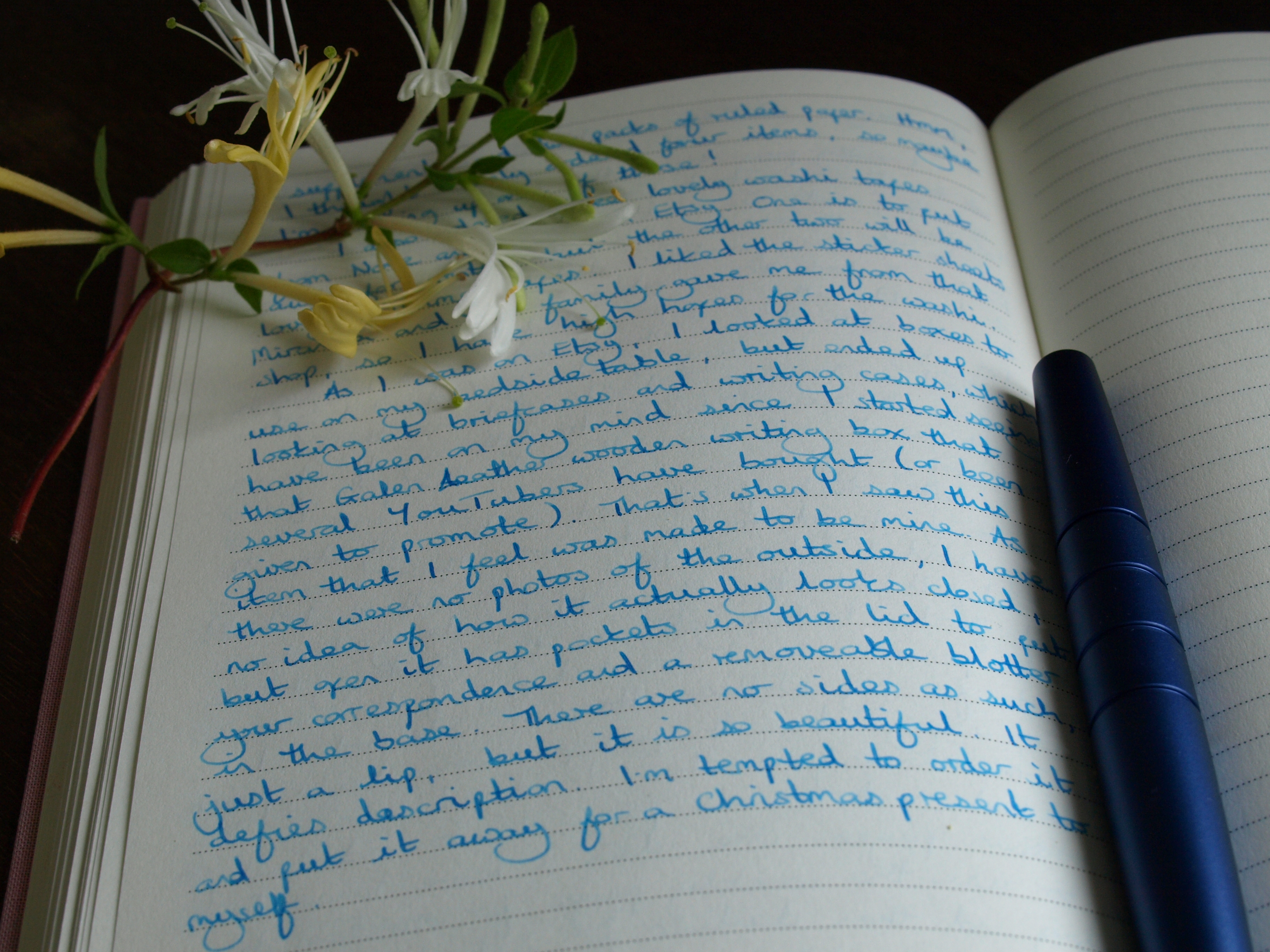
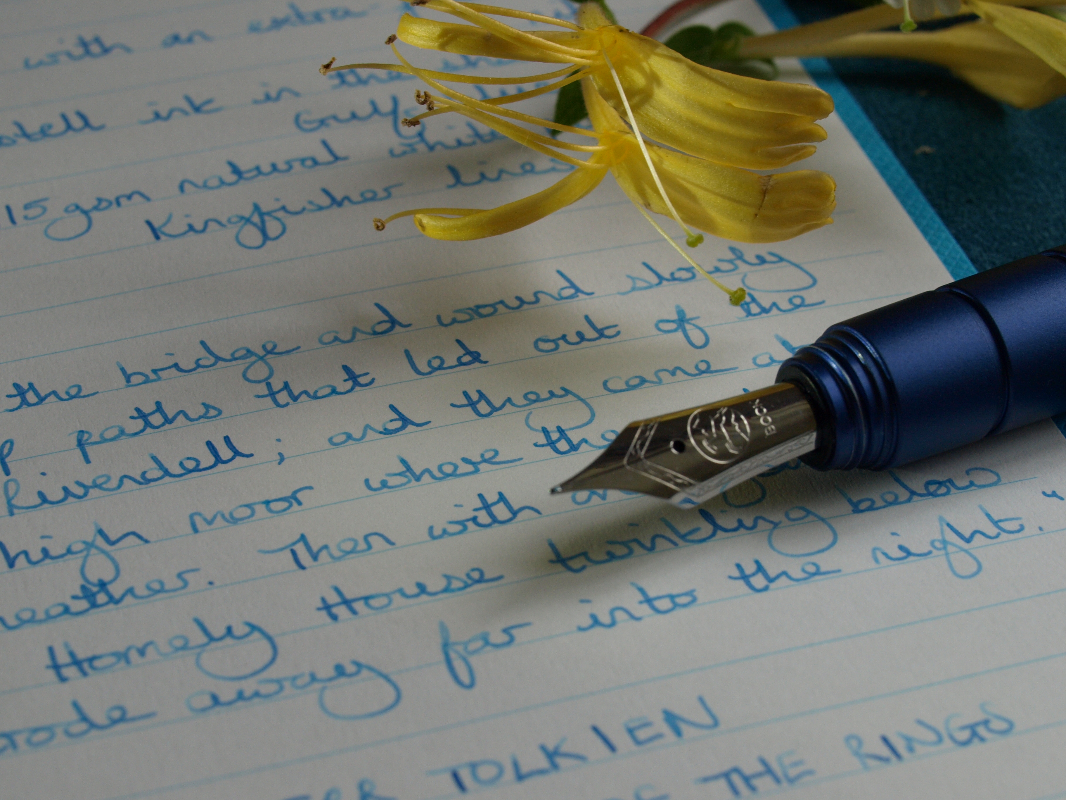
It is two weeks since I grabbed my Namisu Orion and shoved in a cartridge of this ink to see if it would play nicely with my journal. Every morning since then I have picked up the pen and been blown away by the sheer joy of writing with it. The nib seems to love this ink, bringing out the exact colour printed on the box and, much as I refuse to be seduced by fancy-shmancy gimmicks, just look at how it shades from light to dark with the varying strokes.
I wondered if part of the spell was simply that this nib and ink work so well with the temperamental paper in my current journal (which I will be finishing in the next fortnight, praise be to the Lord of all Stationery) and I thought I would check out how I like it on the sheets I will be using next. It seems just a little more washed-out – that was my original gripe with the Gulf Blue ink back in the days before I fell in love with it – and yet, somehow, it is still a handsome beast and I simply can’t fault it.
So all in the garden is rosy, is it? Heck, no! I have one more cartridge left and then….

2 responses to “Creeping in”
I love that color!
It is fab, a midway point between the deeper blues and turquoise.