
The thing about the planner community is that our photography can, at times, tend to focus on the externals whereas, of course, what actually matters is the paper inside the cover. I’m not saying that the cover isn’t important, it is. We choose our covers to convey, to ourselves as well as to the outside world, something about who we are. Planners who regularly switch their covers around take it a step further and use them to convey more transitory changes in season or mood. Inside the cover are the planner pages and these, too, get a lot of attention on social media; attention which most often shines the spotlight on layout and design aesthetics. The actual paper, as opposed to what is printed upon it, rarely garners more than a footnote outside of the fountain pen community.
Using a fountain pen is a fine example of the concept of compromise. With a fountain pen and ink, you get a sublime writing experience. No other practical, everyday writing implement is the equal of a decent fountain pen for legibility, smoothness, or colour options, and a decent fountain pen doesn’t cost much at all. In fact, it almost seems that the more you spend on a fountain pen, the more polarising the actual writing experience can be. However, the advantages of the fountain pen are held in balance by their reliance on the quality of the paper, an area where a “one style fits all” mentality just won’t do. We don’t all want to use the same type of paper, any more than we all want to marry the same type of person. Vive la differance!
As you probably know, I’m using a diary insert by the Stamford Notebook Company in my Filofax A5 Original and I’m really happy with that paper given the fountain pens and inks which I use. It would be wise, though, to note that there are three potential areas where it might not work for others. First, it is a thicker, heavier-weight paper. People who want to keep their planners as lightweight as possible, or to stuff in as many pages as they can, will want to gravitate towards thinner paper. Second, it is rather narrower than a standard A5 size and that might put some people off. Third, it is a cream colour. There are plenty of folk who strongly dislike cream coloured papers and will only buy bright white. Will the Stamford Notebook Company paper appeal to people who love the thin, semi-transparent Tomoe River Paper? Very probably not. It won’t allow the ink to pool on its surface, revealing all the quirks, the sheen and the shading. Then again, Tomoe River Paper with its long dry times won’t appeal to people who want to pack everything away soon after they have jotted a note.
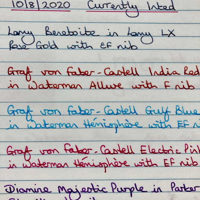
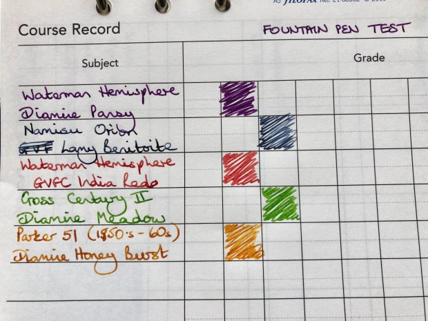
All of which brings me on to the real subject of this post: Filofax brand inserts. Historically, these have been quite poor for fountain pen users, being on the thinner side (good for getting maximum page capacity in your binder) and inclined to cause ink feathering, lots of show-through or bleedthrough, and sometimes beading on the surface – something I’ve often experienced with the coloured pages. The best Filofax inserts I’ve come across so far were the decorated floral ones I used in 2016, but then I tried their geometic decorated ones and they performed very poorly with the inks I’d been using. As I’ve said before, I’ve had nothing but good things to say about the paper supplied with the Filofax Loose-Leaf Notebook range, but found the paper included with the ClipBooks to be even worse than the standard 6-ring binder pages. (Feel free to click on the Gallery of photos to see higher resolution versions.)
Filofax Notebook Paper front 
Filofax Notebook Paper reverse 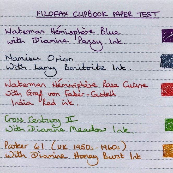
Filofax ClipBook Paper front 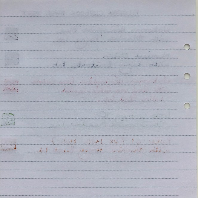
Filofax ClipBook Paper reverse 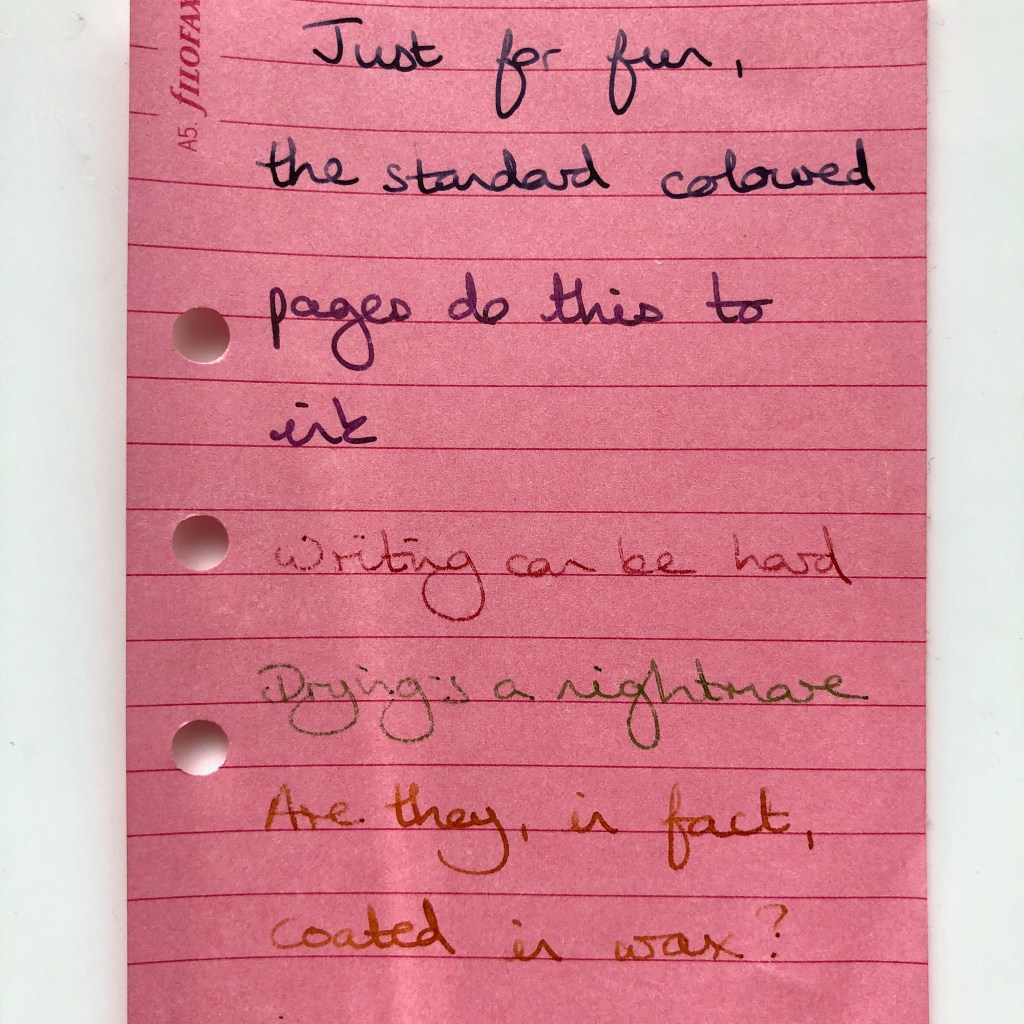
Filofax Standard Coloured Paper front – some inks bead, others are fine 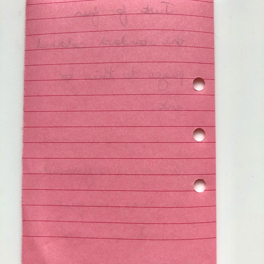
Filofax Standard Coloured Paper reverse
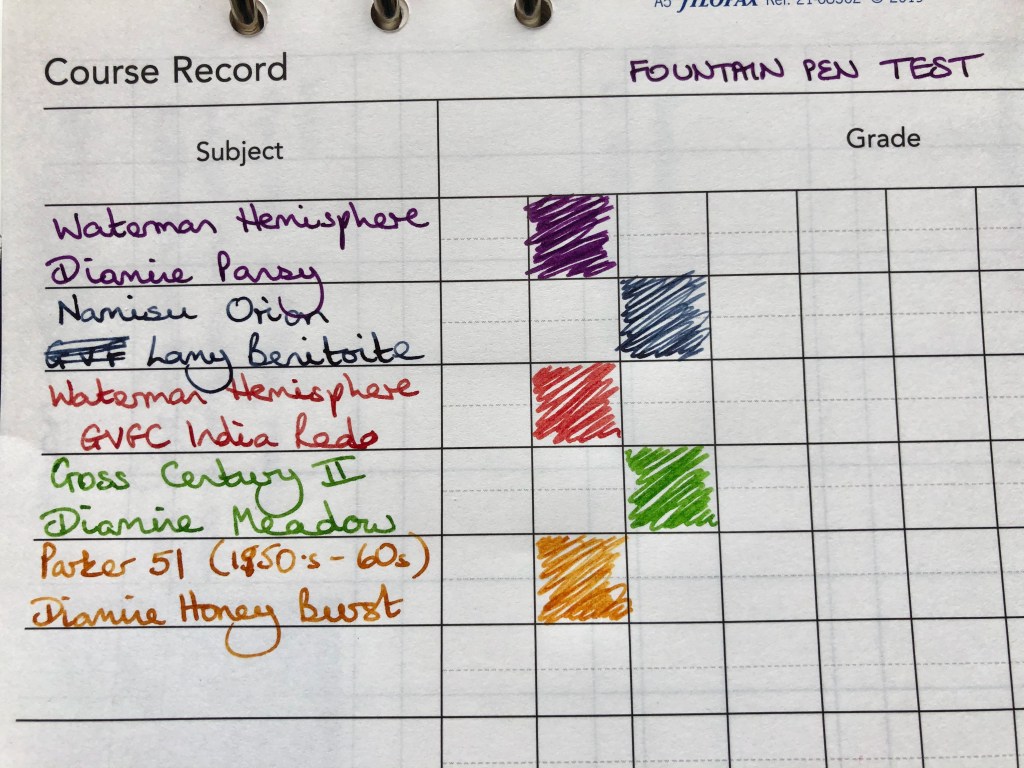
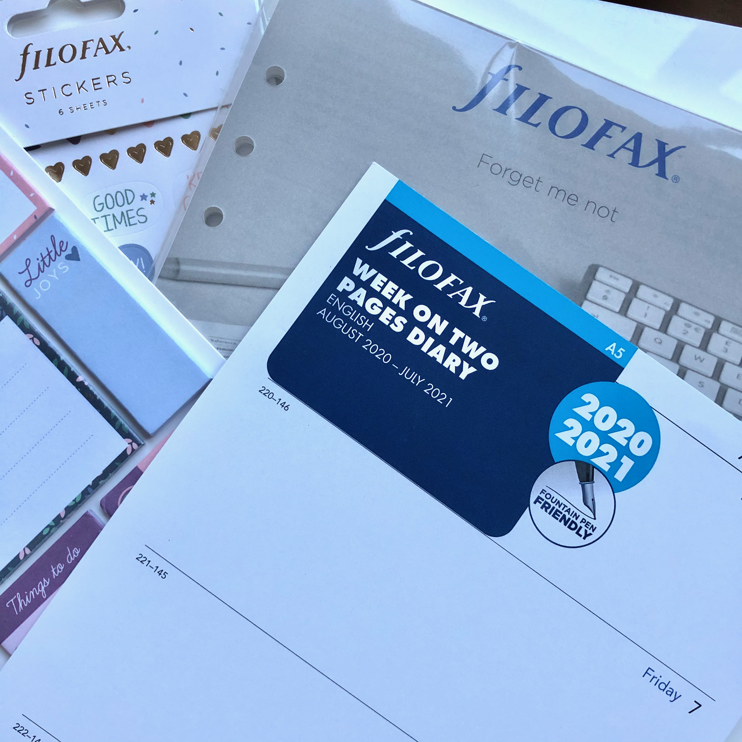
Just recently, however, Filofax have started to label some of their standard inserts as fountain pen friendly and there have been posts of social media supporting this claim. Time, then, for me to put them to the test. The fact that I could buy a 2020-2021 Academic Year insert direct from the Filofax website for the princely sum of £2.10 made this irresistible. If I’m impressed, I can simply cover up the dates and use the insert for next year and if I’m disappointed, well, I’d only have spent that money on chocolate. I’ll admit that as experiments go, I expected this one to be a fail. The inserts which arrived last spring in my A5 Original had a lot of show-through and I thought they were on the latest paper.
In fact, I can happily report that this diary insert is really good. Good enough that it makes me much more likely to see the Filofax as a long-term option and that’s important to me. I’m beginning to look at 2021 as the year when I try to limit the number of brands I’m using in all sorts of areas and I’ve been debating whether Filofax would have to quietly drift out of my preferred options. Writing with the fountain pens was pleasant, the inks showed up nicely, and the showthrough on the reverse was less obvious in real life than in my photo.
Filofax standard insert with fountain pen friendly paper – front 
Filofax standard insert with fountain pen friendly paper – reverse
The real advantage I see to using Filofax brand inserts over those I have been gravitating towards recently, is that there are still shops in my city which carry Filofax products. When shops start trading again, I’d like to be able to pick up a pack of paper in person rather than having to rely on home delivery all of the time, so long as that paper is going to love my fountain pens as I much as I do!

4 responses to “It’s all about the paper”
Lots of good information here. The photos really helped me to understand the behaviors of the different inks and papers.
I’m glad you found it helpful. It’s quite a niche area and most folk who use planners don’t have such restricting demands on the paper. I do sometimes think life would be easier with a pencil or biro, but then it would be less fun. Plus, I just don’t like my handwriting unless I’m using a fountain pen.
I don’t have fancy pens, but I do have favorite pens which really complement my penmanship.
That’s the main thing – pens you feel comfortable using and which allow you to write in a way that pleases you.