
The Cross Beverely is a pen which hasn’t been on my radar at all. I’m not a fan of models where the cap interrupts the streamlined design of the pen and that flared cap wanders dangerously close to the point of overbalancing the design. It’s also a little too bling-y to suit my vibe. I suspect there has been an element of snobbery, too. It’s a design which is neither at the entry-level like the Cross Bailey Light, nor at my “happy” spending level of £80-£100. It sits slap-bang in the middle where you’re not really sure if there’s enough of a step up from the plastic pens and you’re convinced there will be a fair amount of compromise compared to, for example, the Century II.
All of which is to say that, when I hit the stationery department of Jarrolds of Norwich in need of a little cheering-up, this wasn’t a pen I would have dreamt I’d be coming home with. It is not a pen which I would ever have bought online. Yet this is the pen which called out to me when I was looking at all the pens from various brands presented in the glass cases of an actual pen store.
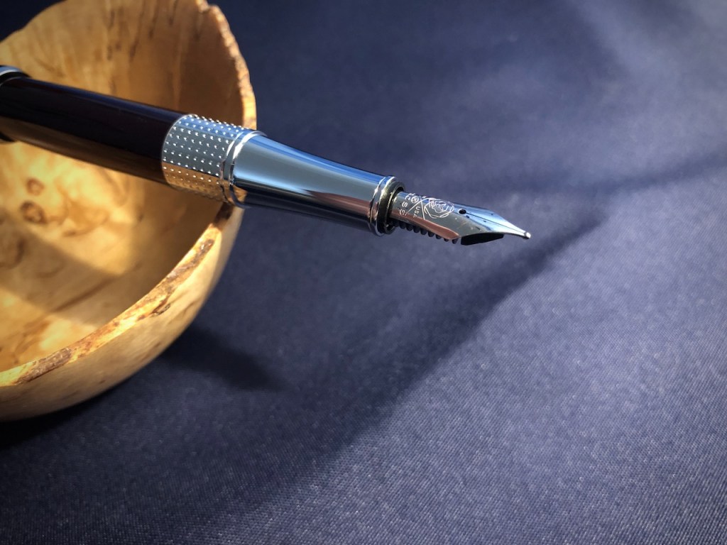
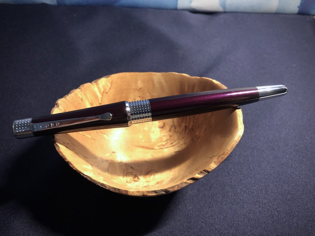
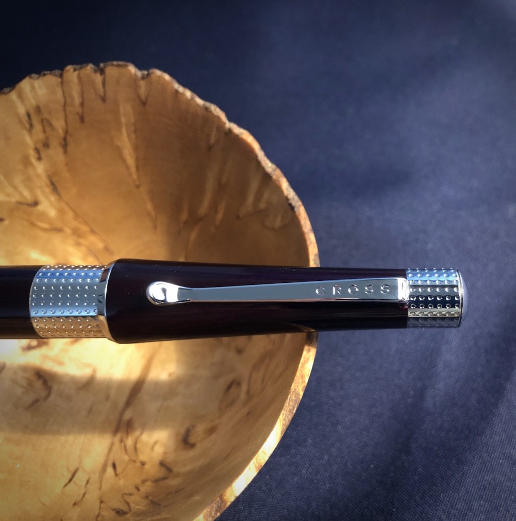
In fact, there doesn’t seem to be much going on in the way of compromise. The pen is metal with a good lacquered finish. The metal trims seem substantial enough. The cap seals very tightly so no drying out if it stands a few days. The nib is a perfectly serviceable Medium, wrote straight out of the box, no skipping or scratching. One word of warning was that there was no cartridge or converter supplied, which is practically unheard-of and would be a problem if it was bought as a gift for someone with no experience of fountain pens. Especially as Cross have their own proprietary design of cartridges and converters. I think the current supply issues with these may be the reason at least a cartridge was not included. Luckily, I have other Cross fountain pens and quickly dug out a converter. I was concerned that it did not push in, then I found that the pen uses the screw-in feature on the Cross converters.
Is the design too bling-y? Overall, there is a delicacy to it which works with the fancier design elements so I think the bling is fine here, where often it wouldn’t be. I know that it’s a little unwise to stroll into the realms of gendering products, but this feels like a lady’s pen to me, based on the size and the look. When describing it, I can’t find any single word that suits it quite as well as “pretty”.
On the day of purchase, I did intend to buy a Cross pen, I will admit. I like their pens for their overall good behaviour, although that may actually make them a little boring and I can understand them being under-represented when it comes to general fountain pen collecting. They are little workhorses, not temperamental thoroughbreds. And this Cross Beverley fits right in there, with the kind of design elements which appeal to people who don’t use fountain pens, perhaps more so than those that do.
I wish they had had the bright red version on the day I was out looking for a new pen, because I think that might have been the best purchase of all. But this plum/damson/aubergine colour really hit the right buttons for me. Surprisingly, I didn’t just ink it up with the Scribo Notturno Viola to fit in with the rest of my April pens. Instead, I decided on Waterman Tender Purple, to provide a bit of a compare and contrast element to my month.

4 responses to “Beverley”
This sounds like a good find. I have never tried one. I did think for a moment from your post title that it was going to be a Jilly Cooper novel or a city guide for Yorkshire!
I thought about adding something about the Yorkshire city of Beverley because it has connections with my mum and dad, but ended up just going with talking about the pen.
I’ve not come across this model before and it made me chuckle; it looks like it was purpose designed for the average heavy metal band to write their shopping lists. I foresee a Judas Priest Limited Edition, in black of course!
Thanks, Nick. I’m slightly horrified to think this might be the thin end of the wedge and I’ll wake up one morning thinking the Montegrappa Chaos is a pretty cool design.