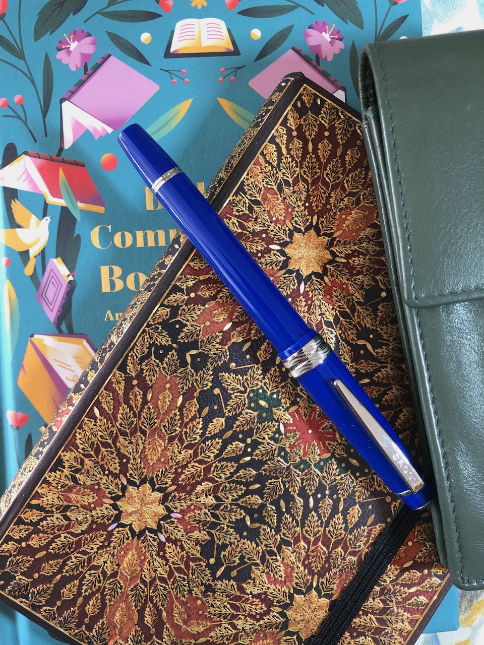
I received this Paperblanks hard cover journal as a Christmas gift from a friend and it was not my intention to use it as my daily journal. In fact, I had decided to keep quotes in it and I had completed the first three pages, though I hadn’t got beyond that. There were two factors which persuaded me it would not be a good journal. The size is rather smaller than A5 (the book measures 130mm x 180mm x 26mm) and I’m an A5 girl. I go larger on occasions, but rarely smaller. The proportions of this book are admittedly very pleasing, but it didn’t strike me as a journal format. The second factor was a concern over paper quality based on historical experience. I’ve had Paperblanks journals in the past which have been a little fussy about which inks they liked. The paper in this volume, though, is very friendly to my inks and seems not to be bothered by which pen I use.
Since the start of February I have been eager to finish the Clairefontaine 1951 bound notebook as I have found myself falling out of love with bright white paper. Hardly a morning has gone past without me counting forward to see exactly when I could expect to complete the final page. However, for some reason I did not put as much thought into the book I would be moving into. Indeed, I failed to plan this at all. You may recall I recently had a week’s annual leave from work which would have been the ideal time to procure a new journal. I even spent time in a stationery shop specifically looking at the lined notebooks. Somehow, though, Saturday morning rolled round, the final Clairefontaine page was filled and there was no blank book waiting to be started. Grocery shopping was an absolute necessity, so I faced the choice of either buying a cheap notebook or treking into town on a stationery expedition later in the day. That is the point where I looked across my living room at the Paperblanks book and decided it would be ideal so I quickly overwrote my previous “quote book” programming and decided to call it my journal.

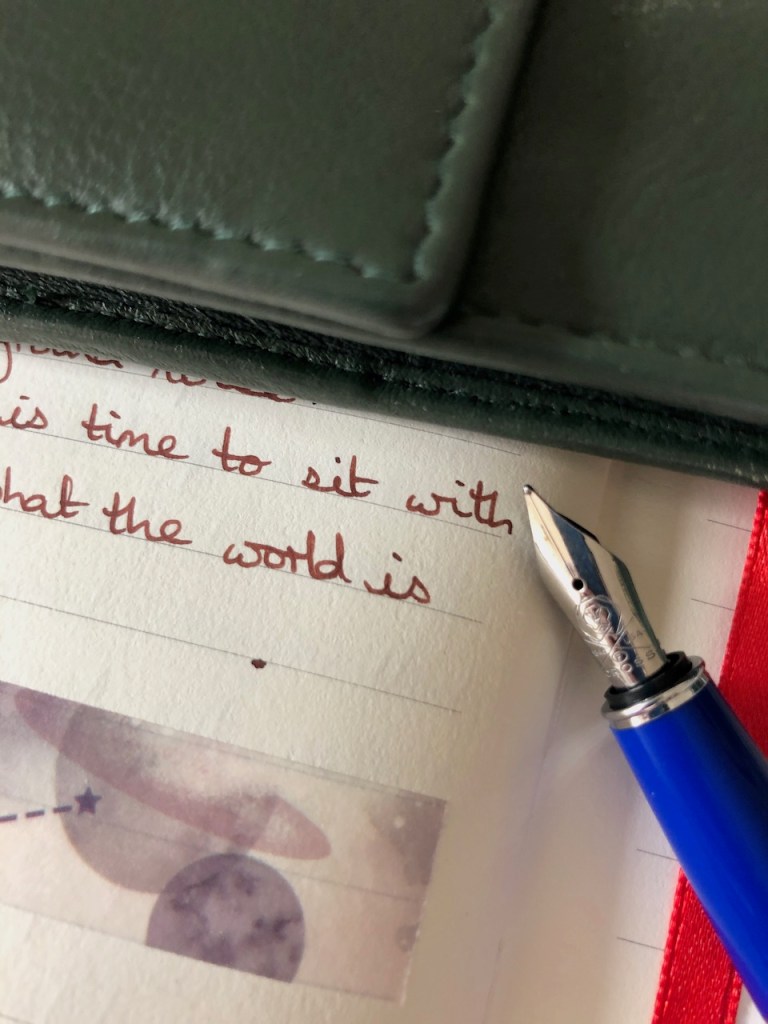
The paper in this book really is lovely – thick, creamy, excellent line spacing. I was keen to see what it would make of the pairing of Waterman Absolute Brown ink and the Cross Bailey Light pen. I had run into difficulties with this combination in the Clairefontaine book, finding that it would start out fine but by the end of the page the ink flow would become quite restricted. This resulted in the colour fading towards the end of a page and the pen being less than entirely pleasant to use as the nib became drier. The jury is still out as to whether this pen and ink behave better on the Paperblanks pages – the first couple of days have been a bit mixed. If pressed right now, I’d say it’s a bit better, but probably not the most comfortable of pairings. I still have almost three-quarters of the converter full so it will be interesting to see whether this one survives through to the end of the month.
I’m already having thoughts about a couple of pens and inks I want to use through March, the inks put me in mind of spring. I’m thinking ahead to March, but I already have a cunning plan in place for April. I think it’s due to watching a lot of “currently inked” videos on YouTube.
I am also working through my washi tape collection, using strips as separators between journal entries. I finished two rolls of nice blue washi in the Clairefontaine notebook and I am very fond of how this planetary design complements the cream paper and brown ink. So far, it’s a satisfying start to the book.


2 responses to “A fresh journal”
I agree, WHITE paper is very painful and discourages journally. I cannot use blank pages, no sense of direction.
I sometimes wonder whether this fountain pen hobby might encourage a certain amount of fussiness…..