It’s okay, your narrator hasn’t plumbed the depths yet. The bottles I’m going to talk about are filled with ink, not gin.
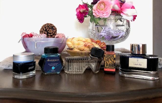
I thought it might be fun to explore which bits of my personality are drawn to the different ink bottles that I own. When I see my, admittedly limited, collection it strikes me that each bottle has its own appeal. So, let’s work from left to right.
The Lamy Crystal bottle (jar?) was definitely bought by the part of me who hangs out with the CAD team and knows how to fold their A0 prints perfectly. The rounded triangle shape, that big silver lid with the band of colour representing the ink, the font Lamy uses, it’s all very design-conscious. The trouble being that there is a little bit of practicality missing (did I mention the CAD team?!!!) and I feel a few sacrifices have been made in the pursuit of originality. That large lid is one of them. I find the ‘jar’ shape with a wide neck encourages ink to collect in the lid and every time I open this bottle I end up with ink on my hands. Even opening the bottle is difficult as it’s a lid which has a strong tendency to stick shut. I’ve noticed a couple of other brands have recently moved to a ‘jam jar’ aesthetic and I can’t help but feel it’s not quite the right direction to go in.
The Waterman bottle belongs to my inner schoolgirl. The choice was Parker or Waterman, blue or black (she chose blue-black, of course). Life was easy, the holidays stretched out forever, and everything she did was stored away for the first day of school when she would get to crack open a brand new exercise book. Although she’s a long way in my past, she’s the one who secretly believes if there was only one fountain pen ink in the world, it would have to be Waterman.
The Montblanc “shoe” bottle calls out to practical old me who revelled in buying an expensive ink years ago at a heavily discounted price and is currently putting in a ridiculous amount of work to clean out the bottle so I can decant another ink. It’s the design that pulls me in on this one: that reservoir in the “heel” which means I can get sufficient depth to fill my pen even when the main chamber is getting low. Practical me also knows that the ink is never going to clean out and I’m going to end up dumping this bottle.
Just a little to the side of practical me, sits frugal me, and she is the big fan of Diamine inks. Frugal me is heavily entwined with greedy me, and the 30ml plastic bottles hit that perfect spot of allowing the greatest variety of ink for the lowest price. She’s happy to put up with the rather unstable bottles and the narrow necks which make it a challenge to fill her pens. “Stand it in an egg-cup!” she says. “Suck up the ink with a syringe!” Apparently frugal me finds it easy to hoodwink herself: once she’s bought the ink and the egg-cup and the syringe, she could have had a bottle of Waterman ink instead.
At the other end of the scale lies extravagant me who knows quality when she sees it and she sees it in Graf von Faber-Castell ink bottles. Extravagant me imagines herself with a vaguely Germanic background, like the hero in “The Prisoner of Zenda”. A little touch of the Saxe-Coburgs. She doesn’t want to be a queen or an empress, she just wants to sit in lofty contemplation amongst exquisite furniture and the best inks and paper the world can provide for her. She knows any product worth its salt doesn’t have to employ gaudy wrappings, it stands on its own two feet. Like the bottle with its impressive base and sturdy metal cap, she enjoys a stability of purpose. There’s little chance of this bottle toppling over as she fills her pen, and her own roots provide a similar resilience to the winds of change. She may possibly have a touch of megalomania about her.
So, do you have a favourite ink bottle and does it have characteristics that appeal to a particular element of your own personality? If you don’t use ink, maybe play the game with scent bottles.

