I ended up choosing a cohort of blue inks for June, which may have been a mistake as the sky now seems to think that it doesn’t need to contribute any blue to the month at all. A monochromatic month may seem a trifle boring, but it suits me because I can’t seem to get enough of blue ink at the moment. I looked to HG Wells and “The Time Machine” to give the pens and inks a workout this month. It’s an old, old favourite and maybe a story to slip into my bag for work journeys.
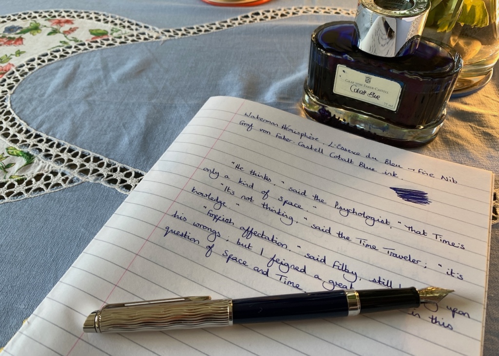
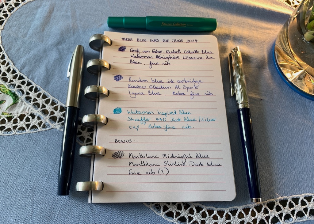
First up, it’s Graf von Faber-Castell’s Cobalt Blue which I have in my Waterman L’Essence du Bleu pen. This combination speaks straight to my soul, especially when I write on a good, white paper. There is something elemental about it. The Cobalt colour is deeper than traditional blues, but it does not stray quite as far as blue-black shades. This is actually a re-inking of the same colour in the same pen after I used up one fill of it at the end of May.

Moving to the lighter side of Cobalt, we come to my next ink which is a mystery to me. It’s an odd bue ink cartridge which was lying around and I thought I might as well use it up. Being ‘standard international’ size, it fit perfectly in my Kaweco Collection Al-Sport in Iguana Blue. Two years down the line, I still love this pen. I have mixed feelings about the ink, though. I love the colour as it first goes down on the page, the colour which shows in my photograph. However, after 15 minutes or so it dries down and becomes very muted, especially on the ivory paper in the notebook I’m using for my journal. It’s fine, I just prefer a look that is somewhat bolder.
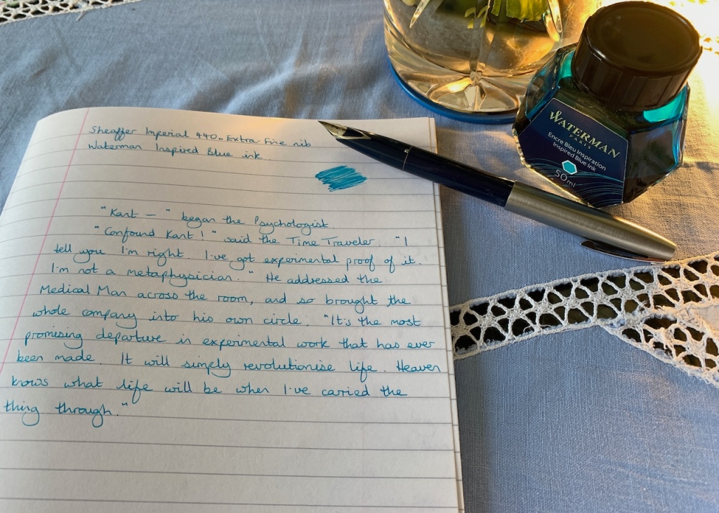
My third ink choice is good old Waterman Inspired Blue which brings a beach theme to the party, edging close to turquoise without actually going that far. One of my favourite blues; what it lacks in depth it makes up for with brightness. I’ve paired this with the latest addition to my fountain pen lineup: a pre-loved Sheaffer Imperial 404 with an extra-fine nib. I’m a fan of the inlaid nib on these pens, it’s such an elegant design. Unfortunately, this one has a tiny flaw which means there is some ink seepage – just enough to leave a “blue spot” of evidence on my forefinger each time I write with the pen. It remains to be seen whether this is a keeper in my collection.
We are already halfway through the month and I am enjoying my blue inks enormously. I’m not even missing the traditional contrast colour I like to have in every ink lineup. The first pen I’m expecting to write dry is the Kaweco, after which I will probably use the Waterman for writing my daily journal entries. Only two weeks to go and we will be heading into the second half of 2024, with a fresh take on inks which, who knows, may banish the grey skies for a while.

I also inked up a mysterious unknown blue ink this month. My friend gave me an ink sample that lost its label somewhere along its journey in her collection. We’re uncertain how long she’s had it. It seems to be blue at first glance with a slight green lean. I like it. But I think I like it more than I should because of its mysterious nature.
I wouldn’t know what to do with an all blue month! But maybe it’s something I could try considering I also have too many blue inks. It would be fun to see if I can even tell the difference by then. 😀
Hello, thanks for your comment. Your mystery blue sounds lovely. I must admit I was warning myself not to get attached to the shade in the cartridge because I would drive myself crazy trying to find out which particular ink it was. I wonder if you are like me? I watch these comparison videos of people trying out different shades of the same colour and have a running commentary with the screen about how they are all exactly the same!
I also do a running commentary on swatch videos to see if i have a duplicate similar enough already. A way to stop myself falling for clever ink marketing
The Faber-Castell’s Cobalt Blue is one of my favorite blues, for the color reason you mentioned.
It is a lovely shade of blue. I used to be very fond of Cross Blue-Black many years ago, but it’s not always so easy to get hold of Cross inks hereabouts.
Lovely ink selections! I’m definitely starting to appreciate blue inks more these days. And I love the idea of having a monochromatic month and sticking with just one colour theme! I may have to try that.
Thank you, Laura. I’ve long preferred blue-black inks to blue, but like you I’m starting to appreciate the mid-toned blues a lot more. I’m planning a different monochrome for next month, but I’m sure I’ll get bored soon and revert to more colourful inks. The trouble is, I’ve got a title for a blog post which is making me giggle, but I don’t really have the inks to make it work. I’m having to force myself not to go ordering things just for the sake of a cheap laugh.
I’m definitely curious about your blog post title now! I’ve had that too though where I’ve had to talk myself out of buying things specifically to use for a blog post.