
I am setting off into the second quadrimester of the year with four fountain pens inked and ready to go. Two of these are carry-overs which I have been enjoying over the past few months; the other two are new pairings which should provide an opportunity for exploration and excitement.
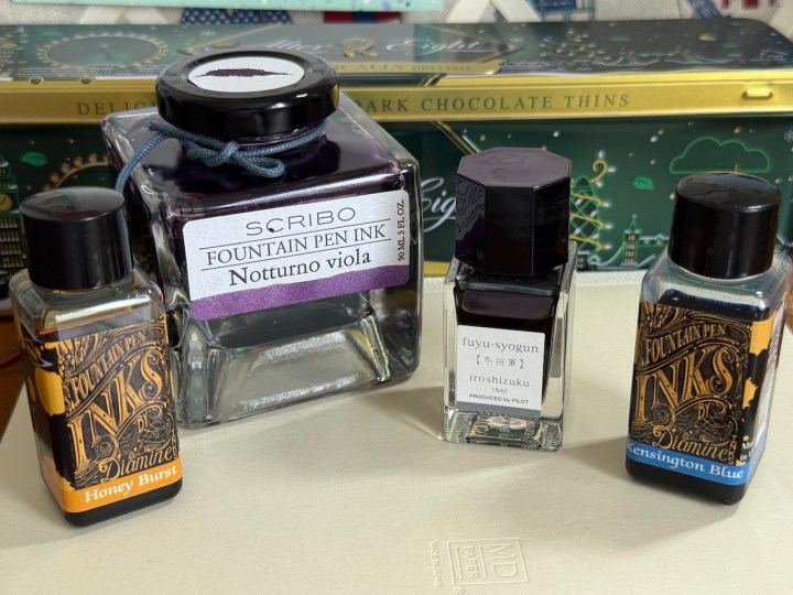
Cross Beverly, medium nib, with Diamine “Honey Burst” ink

I generally favour red ink as my main contrast colour. I love red ink – it grabs the attention and quickens the pulse. However, when I want a rest from red I turn to Diamine’s “Honey Burst” – a less dominant colour but still a healthy contrast. I especially like it paired with purple inks, that classic purple and gold combination always hits the spot. I’ve used this pairing to add horoscope symbols to my Filofax diary pages, and to write the date for each morning’s journal entry, which minimal usage means one fill lasts a long, long time. I inked the pen at the beginning of March and still have a third of the fill left. I don’t think this will last me through the whole of Q2, but I could be wrong.
Onoto Custom’ oblique nib, with Scribo “Notturno Viola” ink

This continues to be my no.1 pen and ink pairing and it is my go-to for daily journal entries in my Silvine exercise books. This pen and ink love each other and who am I to stand in the way of such passion? I did go briefly off the rails in April when I filled the Custom with one of the Iroshizuku inks, but I dumped it halfway through the fill – it just wasn’t the same. You can’t deny when something is empirically right and it’s a good job I’ve got such a massive bottle of this ink. In my ink notebook, I see a golden rim around some of the heavy, dark splodges though in writing I have to exercise a lot of imagination to think there might be any hint of another colour. Based on my typical journal writing of two to three 9″ x 7″ pages per day, the pen needs filling once a week or so – it’s the pen equivalent of a Jaguar car!
Lamy Studio Aquamarine, medium nib, with Diamine “Kensington Blue” ink
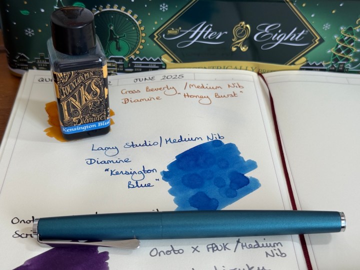
Next up we have two members of my collection which I don’t think have danced together before. The Lamy Studio is a beautiful pen and always a joy to bring back into my currently inked set. I won’t lie – I chose Kensington Blue because it’s such a good match with the new Filofax cover. Sometimes, your eye just likes a particular colour and you go all-in. Not that there is any chance that I’ll actually use this pen and ink in the Filofax because I may never tire of the faithful planner combination of Montblanc Slimline/Montblanc Amethyst. I thought I might use the Lamy/Diamine pairing for the creative writing challenge, but so far that duty has been taken over by my next choice. I have, though, discovered (re-discovered?) an issue with the Lamy converter – the ink is leaking out of the back end. If I’ve said it once, I’ve said it at least two or three times: I don’t get on with Lamy converters. The leaking doesn’t affect the pen’s ability to write, but it makes a mess inside the barrel and it’s just altogether wrong. I’ll have to clean it out and syringe-fill an empty Lamy cartridge instead.
Onoto x FPUK Scholar, medium nib, with Pilot Iroshizuku “Fuyu Syogun” ink

I like this combination! The nice, wet, medium nib of the Onoto keeps the writing legible and brings out the vague blurple undertones in this grey ink. I’m getting just the right amount of shading on William Hannah paper, though not in the Midori M2 notebook that I use for my ink testing. A week into June I have consumed almost a full converter, so I’ll be refilling this in the next couple of days. The smooth writing experience is just what I need as I work on the creative writing prompts each evening. The pen’s weight makes it a perfect companion for medium-length writing sessions, keeps thing moving along, but doesn’t run away ahead of your imagination. Lovely stuff.
I think it would be wise to give a short update on nib widths. You may recall I was all in favour of fine and extra-fine nibs for years, then transferred my allegiance to medium nibs this year. Well, the medium nibs are still ringing my bell. I am enjoying the experience of running through ink fills a bit faster and being able to get the most out of a few inks that I haven’t enjoyed when paired with finer nibs – either they have been too pale, or they have not been able to display their unique colour as I’d like. That said, there will always be a big place in my heart for my fine nibs and some inks really suit that crisp, clear line. Plus, a fine nib is a must for narrow lined paper and I’d always recommend it for paper that doesn’t play happily with a heavier flow of fountain pen ink.
My plan right now is to stick with these four pens and inks through the summer and then choose another set come the end of September. By that point, I’ll have had the Onoto Custom for a whole year so I may be ready to let it have a rest. Hmmm, we’ll see about that.
