

I’ve been leaning heavily into the blue inks for a while and that has been good. I particularly enjoyed using Waterman Inspired Blue in my Lamy LX Rose Gold with its extra-fine nib. More specifically, I enjoyed using it with my creative writing notebook which is a Rhodiarama A5 lined notebook. The creamy paper and the not-exactly-turquoise ink were a match made in heaven; so much so that I considered ordering another Rhodiarama to take over when I finish this notebook, but the price was astronomical. Instead, I bought an A5 Midori M2 notebook from Jarrolds (yes, my local stationery shop now stocks some Midori products). Once I got it home I realised I’d rather dedicate this book to playing with inks, so that leaves the writing notebook in the “to be resolved” corner of my mind.

Being slightly blued-out, I decided to sit this morning and swatch my other bottled inks so I could make a choice about September.

I’m fairly sure I want a fill of Herbin’s “Cacao du Brésil” so that was my very first swatch. I think Diamine’s “Honey Burst” co-ordinates well with it – they feel like a cooler pairing where Waterman’s “Absolute Brown” and Pilot Iroshizuku’s “Yu-Yake” feel warmer to me.
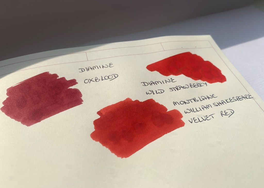
As I was swatching it occurred to me that Scribo’s “Notturno Viola” is going to match the Lamy Safari Violet Blackberry pen, but I’m not sure that purple where I want to be right at the moment. I’m equally unsure about the reds. Diamine’s “Wild Strawberry” always draws me in, and I’ve got a significant amount of it still sitting in my Namisu Orion. Swatching them together, I realised that “Wild Strawberry” and “Velvet Red” share some chromosomes, with Strawberry being the outgoing, slightly brash one, and Velvet being its rather more introspective cousin.
I think my heart is leaning towards a cool trio to start September off:
– Cacao du Brésil
– Honey Burst
– Fuyu-Syogan
Then I’ll keep the Wild Strawberry going for those wild, strawberry-ish moments.
All that remains is to choose the pens.

4 responses to “Choosing ink”
It seems we are on the same wavelength, I am using the Midori Notebook for swatches as well, and for trying out new inks. It looks like you are going for autumn colours this month. I decide to try out scented inks from DeAtramentis raspberry and strawberry and whisky which is close to your Diamine Honey Burst. Hope that you will soon decide what pens to use for this month. September will be a colourful month for you. Regards, Eric
Your DeAtramentis inks sound lovely. I’ve carried over my Namisu Orion with Diamine’s Wild Strawberry and my lovely Waterman L’Essence du Bleu which still has a little Diamine Kensington Blue. Then I’ve settled on my Cross Century II, Parker Sonnet, and Lamy Studio for the new ink colours.
I enjoyed seeing your ink palette swatches. Choosing a few colours for a new month is a happy task. I wonder if there are similarities in choosing a wool.
Choosing Inspired Blue for a Creative writing book sounds a very good idea. I have a bottle of Onoto Mediterranean blue which looks a bit similar (I haven’t swatched it against the Watermans ink) but after a little while I seem to revert to royal blues.
I don’t have a monthly pen and ink change-over, but I can see the merits of this system, if you are disciplined enough to have only a handful of pens on the go at once. I am not, and have 16 inked at the moment!
Yes, I think there are some similarities in choosing wool and inks. I believe that daylight itself changes tone as we move through the year, and that has an effect on which colours I gravitate towards. For example, I can love a colour in the cool winter light, but as we move through spring and the light changes to warmer summer sunlight, that colour no longer grips me. And there is always a point at the end of summer when the, frankly minimal, tan I get on my face suddenly looks horrible – the light needs me to regain my winter pallor! Onoto Mediterranean Blue sounds good. I believe Waterman’s Inspired Blue used to be their South Sea Blue. I haven’t been very rigorous in doing a monthly ink change over recent months, but I needed a bit of cheering up yesterday before heading back to the office today after a week off. Some fresh ink colours seemed like a good way to go.