
I feel a need to express some pen love this sunny, spring day.
“Maybe I didn’t treat you quite as good as I should have
Maybe I didn’t love you quite as often as I could have”
Always on my mind Wayne Carson/Johnny Christopher/Mark James
I hope that I don’t mistreat my pens, but I think I have recently been relegating them from the prime position they deserve in my blog posts. It’s time to rectify that, and to shine the spotlight on my current pen and ink choices, especially as I’m starting to think about what to ink up next.
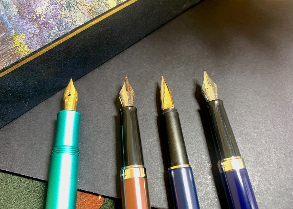
First up, we have the Kaweco Collection (Al-Sport) in the Iguana Blue finish, a pen that is dear to my heart. It has one of those nibs that lends itself to writing on paper that may struggle with broader nibs, and to narrower line spacing on printed pages. This is my pen of choice at the moment in the Letts of London notebook which serves me as my journal.
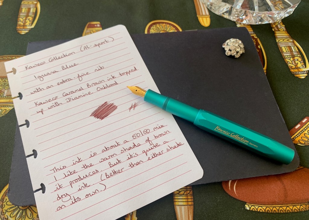
When I inked this up in late March, I put in a cartridge of Kaweco’s Caramel Brown, which I find to be one of those brown inks with slightly earthy, green undertones. When I got halfway through the cartridge, I decided to experiment and topped it up with Diamine Oxblood. This has taken the brown into the richer, warmer side, like a conker shell, and this is very much to my taste. When I wrote my note about the pen and ink combination, it struck me that it’s quite a dry ink, but that’s not detrimental to my way of thinking. It suits the use I’m currently putting it to better than either ink individually.
In many ways, the Rose Cuivre version of the Waterman Hémisphère is a partner in crime to the Kaweco. The lovely orange shade of Pilot’s Iroshizuku Yu-Yake ink perfectly complements the warm brown and they make a lovely pairing on the ivory paper in the Letts of London notebook.

The Iroshizuku line of inks is generally considered to be on the wetter side, and that holds true from my experience with Yu-Yake. I would say the line width from the Extra-Fine nib on this Waterman is closer to the Fine nib on the other Hémisphère than to the Extra-Fine on the Kaweco. I do think this shade of ink looks particularly fine with the pen’s barrel colour which is lucky because it’s taking an age to work through this fill. I’m thinking of moving on to write some notes with it as it is rather wasted just being used for headings.
Shall we talk about the Montblanc Slimline next? This pen enjoys partnering my planner and, for now, I’m happy for it to sit in this niche role. It gets used every day, and goes out and about with me, but I’m not writing vast quantities with it so the ink is lasting a good long time. Montblanc’s Midnight Blue has to be in the running for my favourite blue-black kink.

The more I use the Montblanc, the more I admire the nib. It writes a very fine line width, but behaves impeccably and is a true workhorse. I enjoy using the pen, which is what this hobby is all about. I do have pens which I feel take a bit more effort to love, though almost all of them repay that effort. Of the pens I currently have inked, this one has the most distinctive nib with sides which fold down at, not unlike the nibs from Lamy. This gives the top of the nib a flatter surface when compared to the likes of Waterman and Kaweco where the whole shape is more domed. The other thing I really like about this model is the satisfying click as you push the cap into place when you finish writing. You get the same click if you post the cap on the end of the pen, and it’s a pen that’s really comfortable to write with when the cap is posted.
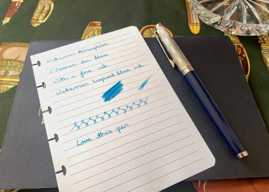
Aesthetically, I’m saving the best until last, because the Waterman Hémisphère L’Essence du Bleu remains a very distinguished-looking pen. The ripples on the cap never fail to entrance me. It’s sparkling at the moment in a pairing with Waterman’s Inspired Blue ink. This bright blue ink, almost a turquoise but without any green undertone, lights up the page and the Fine nib lays down a nice, wet line. In fact, on more absorbent paper you could almost mistake it for a medium nib.
Whilst the L’Essence du Bleu collection is receding into Waterman’s past, they have recently released a similar collection entitled “Reflections of Paris” with the same Seine-inspired caps paired with black lacquered barrels. They are using a mixed metals motif, with the clip and bands being gold-coated whilst the main part of the cap remains silver-coloured. I appreciate the differences between the two versions, but I don’t have any desire or intention to buy any of the Reflections of Paris pens. Black isn’t my thing, blue is, end of story. Anyway, I’m saving my pennies so that I can purchase something super-special if I want to at the Autumn Pen Show. I’m trying to pace myself this year.
On the subject of intention, I’m still working away at trying different inks in the L’Essence du Bleu Hémisphère, to see how I like each one. As I wrote when I was trying out the Rose Cuivre with the Yu-Yake ink, I need to try one of the Iroshizuku inks in the L’E du B next. My sensible head knows, of the three colours I have, it should be Fuyu Syogun, but I expect my less sensible side will win out and I’ll ink it with Yama-Budo.
I’ll try to give a little more love to my pens this week, and a little more blog-space to them, too.

One response to “Pens are always on my mind”
Thanks for sharing some writing examples of your pens. For this post my eyes were caught by the beautiful Waterman Hémisphère L’Essence du Bleu. I recently saw a simular cap, and as you already mention, this was the ‘Reflection of Paris’. Not saying I put this one on my wishlist, but…let’s just say that I follow this one … :-).