

Let us be clear, this is not an ink review. Think of it more as an homage to Montblanc’s William Shakespeare Velvet Red ink. It’s the colour I’ve been using every day since starting my new journal, including the obligatory quote on the very first page. (Turns out I am having a bit of a Roy Wood moment, and that is fine by me.) I capped off the front page with a little Washi sticker from Note and Wish which works well with the colours of both ink and pen body.

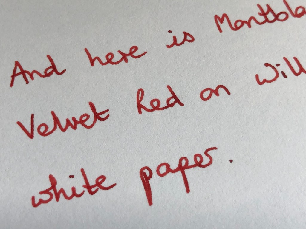
During July I used this ink with the Waterman Allure pen and loved how it wrote, but it’s hard to go wrong with a fine-nibbed pen and, as I mentioned in a previous blog post, I wanted to test it with a medium nib. The pen I chose was the Cross Beverley and, thus far, it is a pleasant experience. It isn’t bleeding through the paper in the journal, nor is it shadowing to any noticeable extent. This makes it an eminently useable ink in my opinion. As you can see in the close-up below, the ink doesn’t feather, but there is a bit of creep along the fibres of the paper; a kind of quasi-feathering if you will.

We can compare that with the performance on William Hannah’s 115gsm coated white paper and here we find crisp lines and a slightly more precise formation of the characters.
I’m enjoying this pen and ink pairing so much that, although I still have some of the orange Yu-Yake ink in my Bailey Light, I hardly ever reach for it. Even for me, it is unusual to use a red ink for everything I write and that is a testament to the way that Velvet Red looks on the page. It isn’t harsh, it isn’t threatening, it’s just lovely and warm and readable. I think if you were looking for a red ink for autumn, this would fit the bill. Or, if you were theming your winter celebrations along the lines of a sumptuous still-life painting, all glistening fruits, the plumage of dead pheasants, and goblets of mulled wine, this would be the ink of choice.
It’s rather sad that Montblanc no longer produce this ink, although they are known to recycle their colours under new names or, if not cloning them, then producing very similar shades, so perhaps another iteration of a this will happen along sometime. I was late to the party myself, purchasing my bottle at last year’s London Pen Show. I only recently started using it, though, and I wonder why I held off so long. Well, I thought I should clear some of my existing red ink first, without realising that this one doesn’t sit exactly where my normal red choices would. It’s not in competition with the likes of Diamine Wild Strawberry or Lamy Ruby, it will build its own niche.
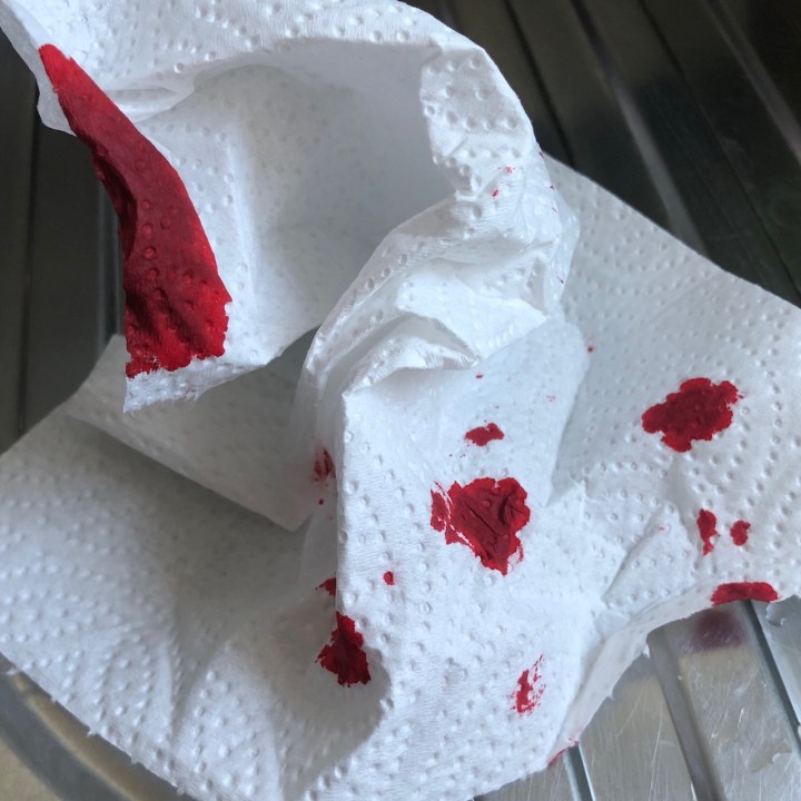
One of the fun things with red ink is that the clean-up stage always looks like the aftermath of a nasty culinary mishap. This shade looks satisfyingly gory on a sheet of kitchen towel.
Now I have had pleasing results with the first two Montblanc inks I’ve tried (I have cartridges of their standard blue-black which I use in my Montblanc Slimline), I’m tempted to see if others in their range are equally well-behaved. My collection has somehow grown to include a few pens with medium nibs and I am watching out for inks which aren’t too temperamental with the whole range of paper I’m likely to pick up. I can have plenty of fun with my pretty Iroshizuku inks on paper from William Hannah or Stamford Notebooks, but sometimes I use paper that needs something a little less lively, and if Montblanc fits the bill there, bring it on.
Well, that about wraps it up. The next page in my notebook is going to be devoted to the best way to theme my Christmas around this ink colour! I’ll need a huge bowl of chocolates in dark red wrappings, which should make for a fun weekend of research.

One response to “She used Red Velvet…”
Thanks Pamela for the elaborate review on the velvet red it is more vibrant red than the Herbin Rouge Grenat which I use.