
I have decided to be Quite Cross this July, but don’t worry. It just means I’m mainly going to be using my Cross fountain pens.
I could have treated myself to a new pen for this month, but nothing has really caught my imagination, so instead I decided on a frivolous ink purchase – the Pilot Iroshizuku gift set.
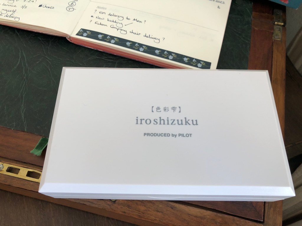
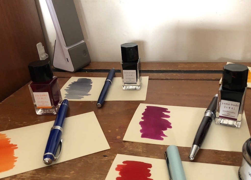
The gift comes in what I had expected to be a white cardboard gift box, but it turns out to be a sturdy, hinged plastic box which is begging to be put to some other use once the inks are finished. Inside are my own choice of three Iroshizuku inks. My grandson was staying with me last weekend, and I had devised an inking-up activity for him to help with my pens for the month. I had my three chosen pens – the Cross Beverley, the Cross Century II, and the Cross Bailey Light. I had my three inks from Iroshizuku, which he got to unbox. His job was to decide which ink to use in which pen.
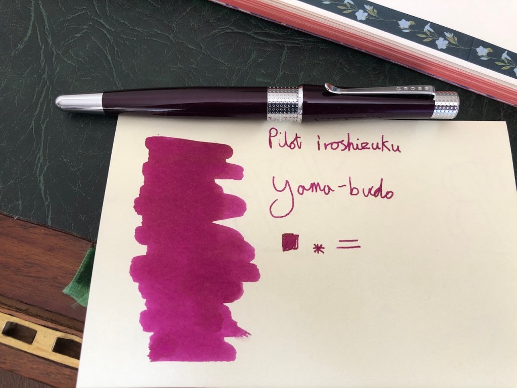
First up, and most predictably, he chose the close match of Iroshizuki Yama-Budo (Crimson Glory Vine) with the berry-purple tones of the Cross Beverley. He loved how this pairing wrote, very smooth as it’s a well-lubricated ink. He also commented on how good the weight of this pen is, and how nicely it sits in the hand.
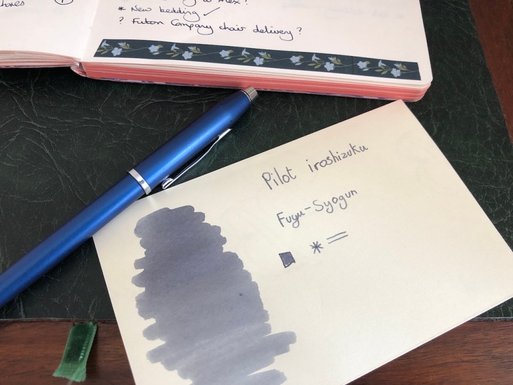
The other inks forced him somewhat out of his comfort zone. He managed a relatively calm pairing next, with Iroshizuku Fuyu-Syogun (Old Man Winter) in the Cross Century II. This is the ink I have hankered after the longest in the Iroshizuku line-up as it always looked as if it sat perfectly on the cusp between grey and blue. I have not been disappointed. It is not too pale, as some greys can be, and it is not a washed-out black as some other greys are. It is legible, and serviceable, yet also a little bit unusual. I’m looking forward to incorporating this into my life for the month.
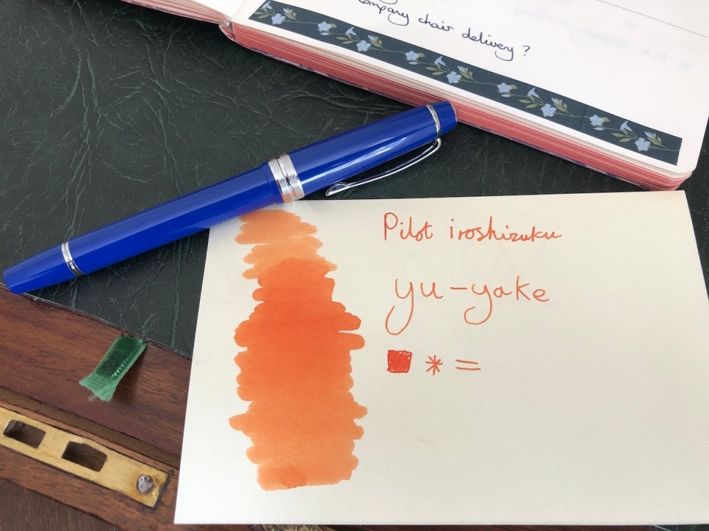
That left Iroshizuku Yu-Yake (Sunset) for the Cross Bailey Light. This is a bright and joyful pairing which I think will bring a touch of levity to my scribblings through July. This is the one Iroshizuku colour I have already tried, having had a small sample of it several years ago. It’s such a lovely, clear orange and I am keen to see how this fits in with my writing requirements. Can I see whole journey entries in this colour? You bet I can!
A week into the month, I can report stellar performance from all three pens and inks in my journal, no bleed through or show through on the lovely paper. The planner paper is a little less forgiving and there’s a bit of spotting through from the orange and berry inks. Not enough to worry me, but I’m definitely leaning towards Old Man Winter for the majority of entries in there.

11 responses to “July: Quite Cross”
Well that is anything but a ‘frivolous ink purchase’. I think it is a very serious and splendid ink purchase. One that has made me a little envious. Im sure those Cross pens will step up to the plate. Such lovely colour. Thank you for sharing them.
Thank-you, Tim. I was tempted to go with an ink selection decided on by a manufacturer – both Iroshizuku and Herbin do these, as well as some brands I haven’t tried such as Colorverse – but being able to choose your own three inks from the range is rather a game-changer. I always feel in the pre-selected ones, there’s always one I’m not keen on. My Cross pens are tried and trusted.
Talking about being cross, I was a bit cross in that my Otto Hutt pen which was ordered in June has still not arrived. Your (old man winter) looks good. I bought a Montblanc cool grey last week and find it is almost similar perhaps a bit lighter and less blue but still legible. At the moment I am using a vintage Aurora 88 duo cart with Diamine Onyx Black. Cartidges for this pen are not available so have to syringe the existing one.
Hi, Eric. I feel your frustration over the new pen. On a similar vein I was hoping to be able to pick up my new reading glasses today, but it doesn’t look like they’re ready which means I’ll have to wait until next Saturday. The Montblanc cool grey looks good. I do the refilling cartridges thing for my Kaweco and I’m heading that way for my Lamy pens because I hate the Lamy converters. They seem fine when you fill and use them, but I find when I’m cleaning them out the inky water seems to leak out the back of the converter and there’s always residue trapped inside the converter behind the plunger. It annoys me immensely.
I think you made your grandson a fountain pen lover.
Bit of work still to be done on that front. He always says he’s not a fountain pen user, but he can see why I am. He’s perfectly competent at handling them and writing with them and there’s plenty of time for him to come across to the path of righteousness. I think I’ll convert him to Apple first, then work on the fountain pens….
What lovely choice. I have yet to buy an Iroshizuku ink, I am envious. I like the first two inks, don’t have anything like them. And you’ve complicated matters by using the Century II. It is the one Cross pen I’ve always been interested in. Thanks for sharing and Christmas is coming (wink wink, nudge nudge)
The Iroshizuku inks have a very good reputation for being well-behaved. I like that they are not too gimmicky – there’s a manageable range of colours, they aren’t releasing new ones every ten minutes, and they haven’t ventured into sparkly ink. Also, there is absolutely nothing to say against the Cross Century II except that it has a very slender section which doesn’t appeal to everyone. It’s one of my great workhorse pens.
I do not like gimmickly inks, forget sparkles. Inks with fregrances I don;t mind because I enjoy the smell of most inks anyway. THat cross reminds me of the ballpoint I used to own and I prefer slender pens.
Interesting article and cracking looking inks which I have never tried, thank you for the introduction. Sadly Fuyu-Syogun out of stock at the Writing Desk at the moment will have to wait a bit longer!!
Rather like you not much out there really catching my eye in pen world at the moment (at least not within in the price range that I have set myself to curb new purchases just for the sake of it!), probably a good thing as the family keep telling me that I have more than enough pens already!! Have to say very much enjoying Faber Castell Hexo with a fine nib, really nice writer straight out of the box.
I am really enjoying that ink selection. I’m interested in your comment about the Faber Castle Hexo. As a pen brand, it’s one I haven’t got on well with in the past, having been underwhelmed by both a Loom and a Grip, yet I read a lot of positive reviews about them and I would like to find one I enjoy. I love the looks of the Essentio.