

I’ve gone all classical and old-school for June 2023 with dark blue inks in older fountain pens. A precursor, perhaps, for a long-distant future where I settle on blue-black ink as my one, true love. Not only classical and old-school, this pair are the hand-me-down pens from my Dad and my brother.

I’ve reverted to the Montblanc Midnight Blue ink cartridges for the Montblanc Slimline pen. This is to reassure myself that I haven’t done some awful damage to the nib after the scary time I had in April when the Scribo ink expelled itself immediately from the converter. If the pen is happiest with cartridges that is no problem to me. I find this a slightly dry ink in combination with the fine nib on this pen, and that makes it perfect for quickly jotting entries in my planner. It works well even with fussy paper, and it exhibits no hard starts or skipping. The ink feels like a true blue-black and hits just the right spot for me.
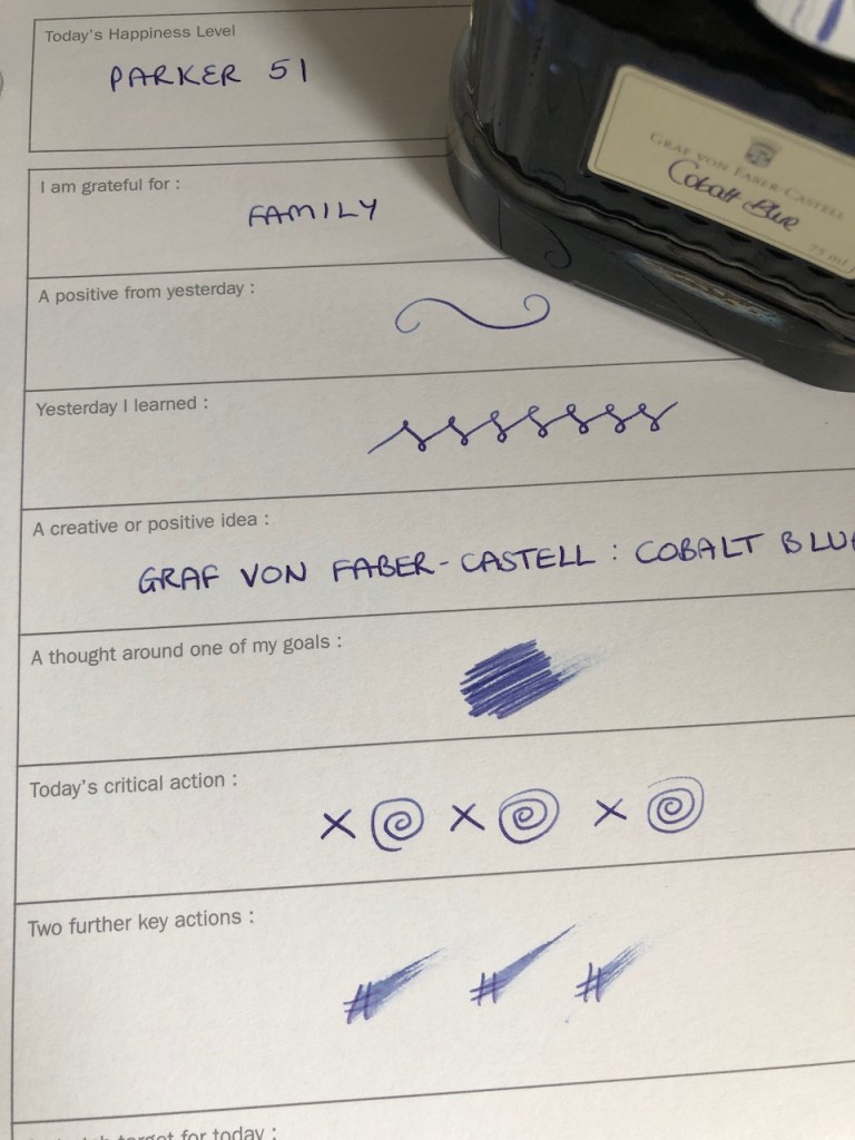
My second ink choice is the Graf von Faber-Castell Cobalt Blue, which doesn’t quite make it into my blue-black category but is a good deep blue nevertheless. I’ve filled the Parker 51 with this one and that is giving me a slightly wider line, though not wet by any stretch of the imagination. This, too, is a good old reliable writer and this combination of pen and ink is going to be a joy to use in my journal for the month.
These two dark blue inks will be supported by the Graf von Faber-Castell India Red which is still living in my medium-nibbed Waterman Hemisphere. It’s taking a good while to work my way through this, but no matter.
I ended May more than ready to move on from the inks I had in use. It was good to use up the final cartridge of Graf von Faber-Castell Moss Green for no other reason than that I’m not really feeling the green inks at the moment. I had thought that I would enjoy using Herbin’s Vert de Gris in a fine-nibbed Waterman Hemisphere, but in practice it wasn’t a favourite pairing. I feel the slightly absorbent paper in my perpetual planner didnt bring out the best in this ink. The pairing which really did make my heart sing was the Kaweco Caramel Brown with the extra-fine nib I put on my Iguana Blue Al-Sport. I think that could be a pen which might suit Vert de Gris, so that’s an experiment to try at a future point.
For now, though, it’s the dark blue of a summer night all the way through to July.

4 responses to “Inked for June 2023”
It is an interesting observation, I had Faber Castell black in my Montblanc and the nib was very wet almost gushing and impractical as the ink took some time to dry causing smudging in my journal. Changed it to Waterman Blue Black and it solved the problem, a good inkflow and a fairly wet nib.
Hi. I wondered whether it was the converter which was at fault, so I feel there is an opportunity for experimentation when I’m in the mood. The pen and, therefore, presumably the converter were purchased in 1989 and had not been used for a number of years when my brother passed them on to me last autumn. The Scribo incident was the first time I’d tried the converter as I was just using the cartridges previously. Part of the experimentation could be to fill a Montblanc cartridge with the Scribo ink as well as trying other inks with the converter.
It continues to be weird and fascinating to me that there really are magical pen and ink combinations and that stumbling upon them is kind of thrilling. They write so beautifully together.
Also, unrelatedly, I got some new knitting needles and the tips are quite sharp, but I am surprised by what a difference that makes. I’ve literally been knitting for decades (on and off) and I guess I’ve never had particularly sharp needles because these are a delight.
Oh, yes, indeed – I still get a thrill seeing Waterman Inspired Blue coming out of the nib of my aquamarine Lamy Studio, for example. The knitting needles sound very interesting. I know I’ve seen knitters who insist it’s better to have sharp tips for lace knitting – Addi Turbos are often mentioned in that connection.